WHEN WE WERE BULLIES
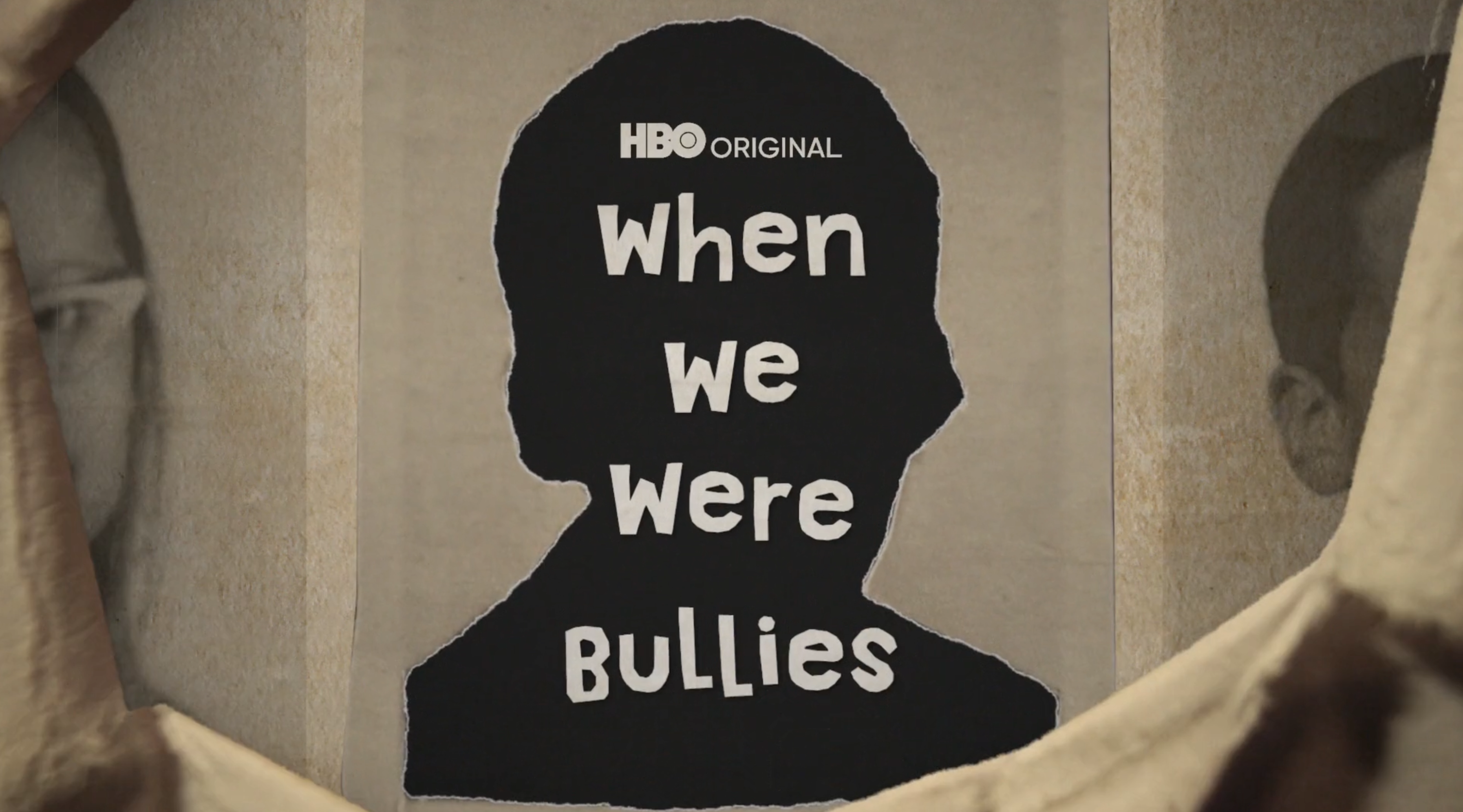
Trailer graphics and title card system for When We Were Bullies, built around a stop-motion-inspired look pulled straight from the film's own animation style.
Overview
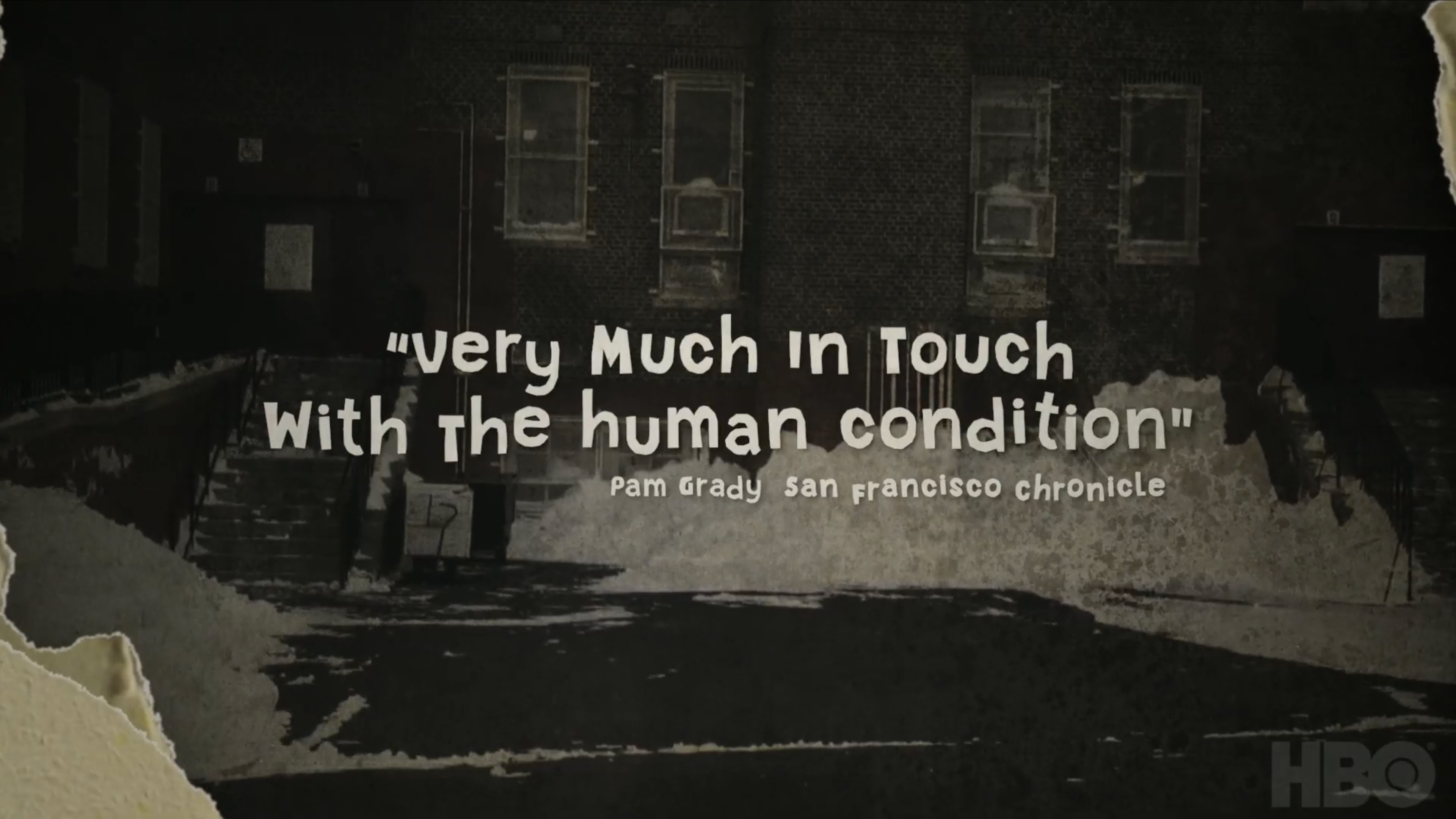
This documentary used a very specific stop-motion animation style throughout, harkening back to educational films from the 1960s to match the era the story was set in. Inspired by that aesthetic, I designed the internal cards and the main title for the trailer, working to make graphics built in After Effects feel like they belonged in the same world as actual analog stop motion.
Reference
Stills from the film's own animation — the visual target the trailer graphics needed to match.
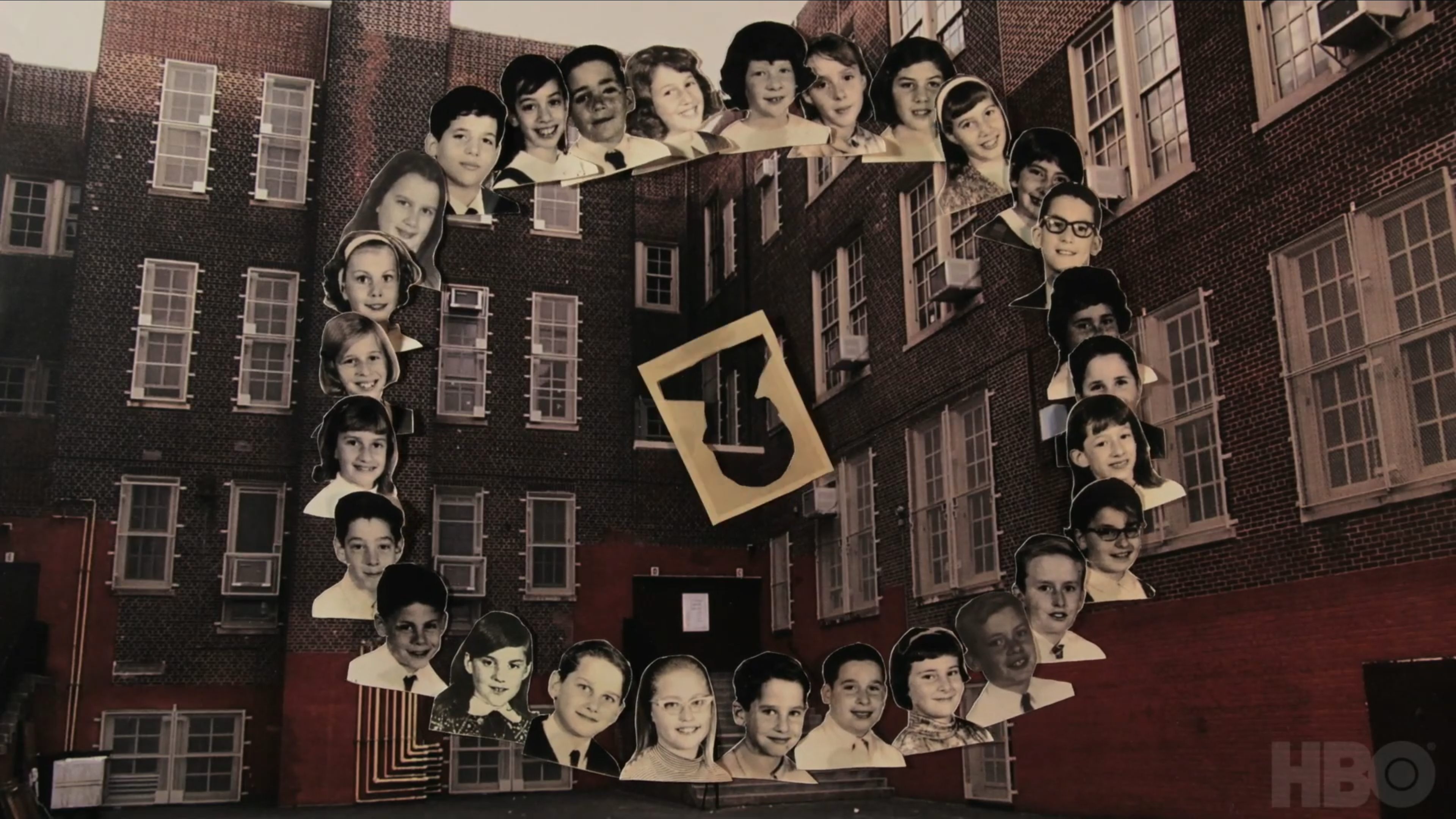
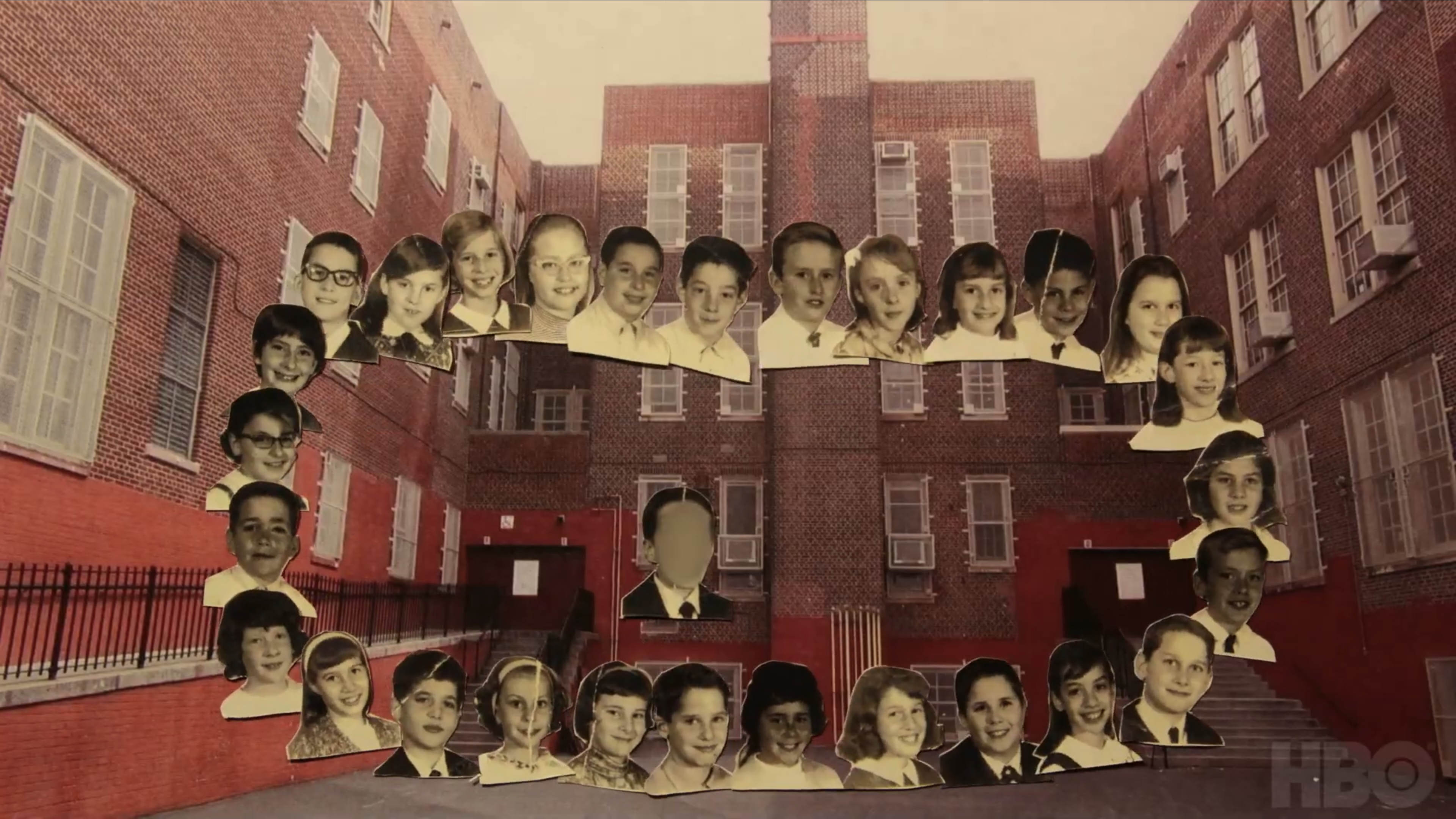
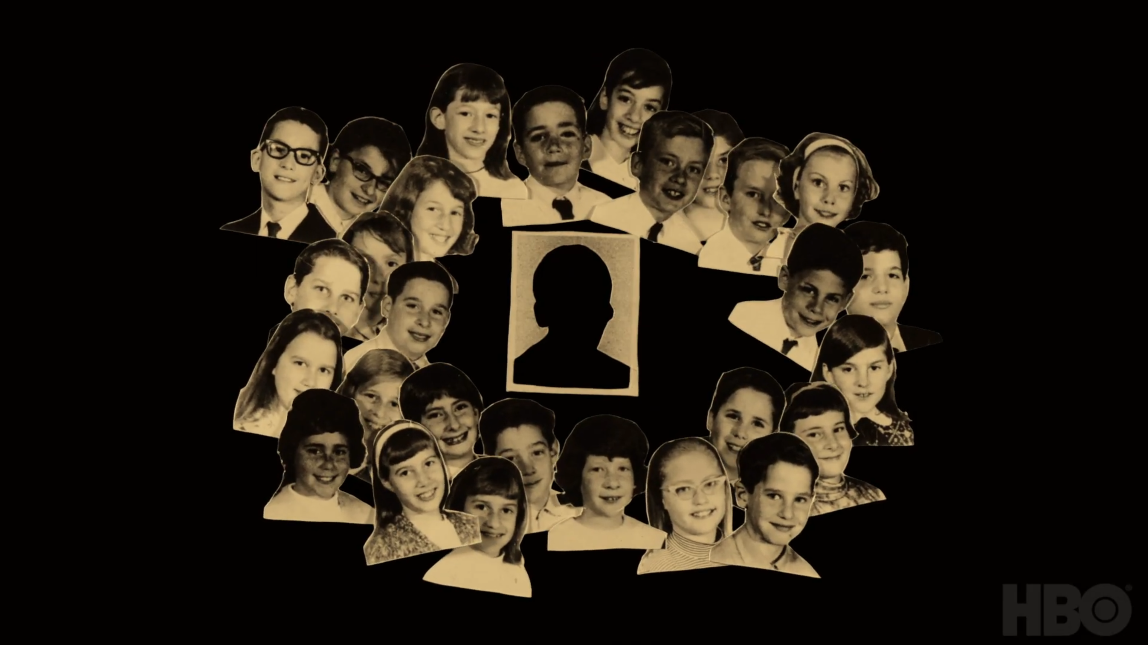
The main title card, built to sit naturally alongside the film's own stop-motion animation.
Process
Since I was working in After Effects rather than shooting actual stop motion, I had to push the animation in a few specific directions to make it read as cohesive with the film's animated sections. I brought the frame rate way down, added a heavy layer of texture and grain across everything, and gave the animated letterforms constant small imperfections and movement — as if they'd been slightly bumped between frames, the way real stop motion often is.
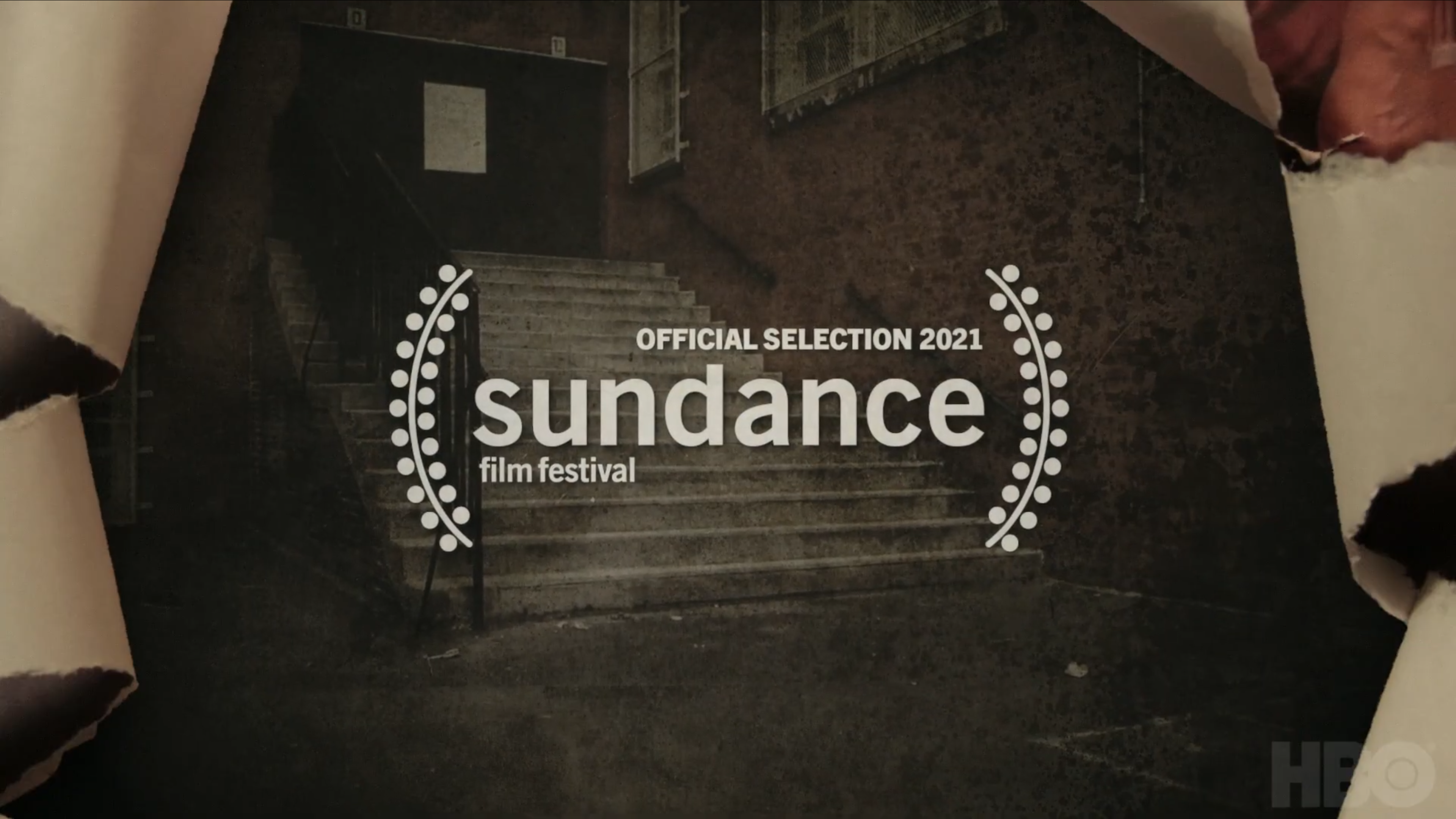
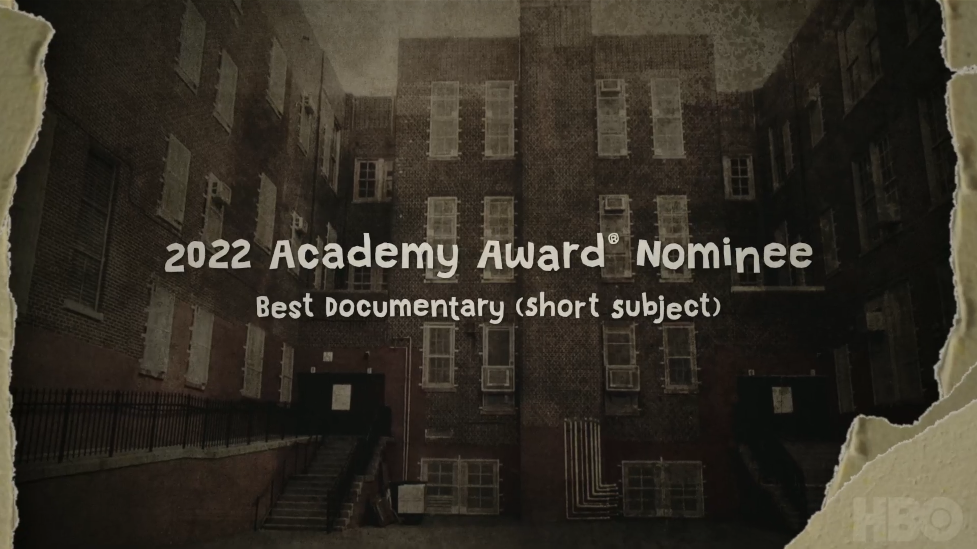
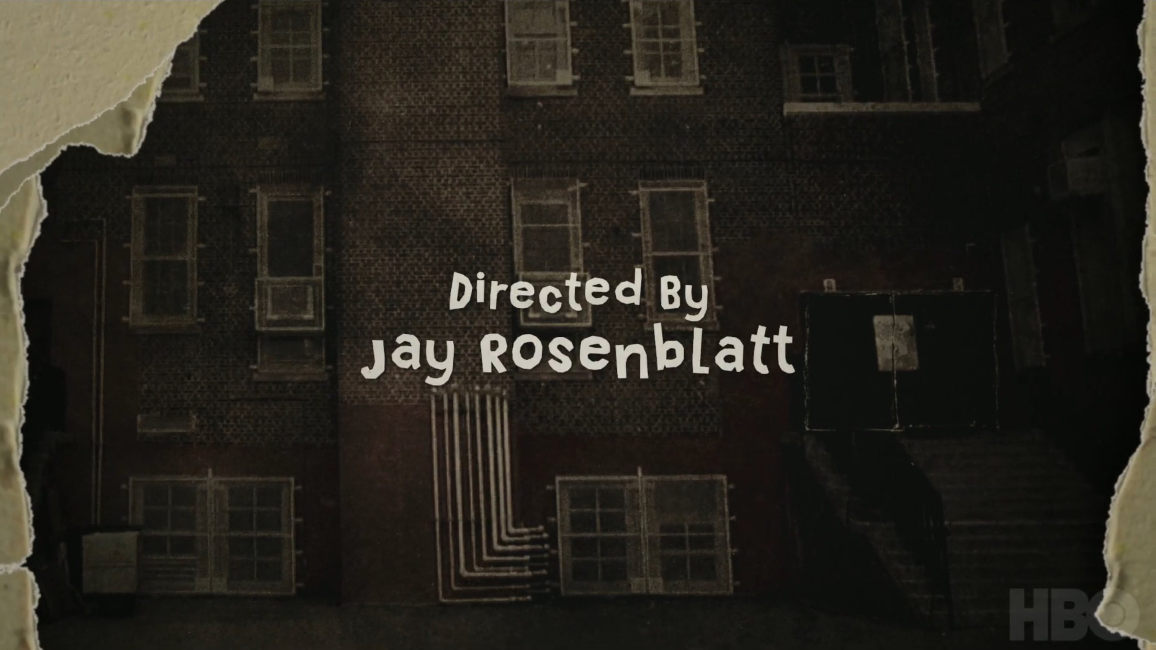
For a handful of the internal cards, including the main title, I rotoscoped existing animation from the film itself and integrated my graphics directly into it — matching movement and timing closely enough that the two blend together seamlessly rather than sitting as separate layers.
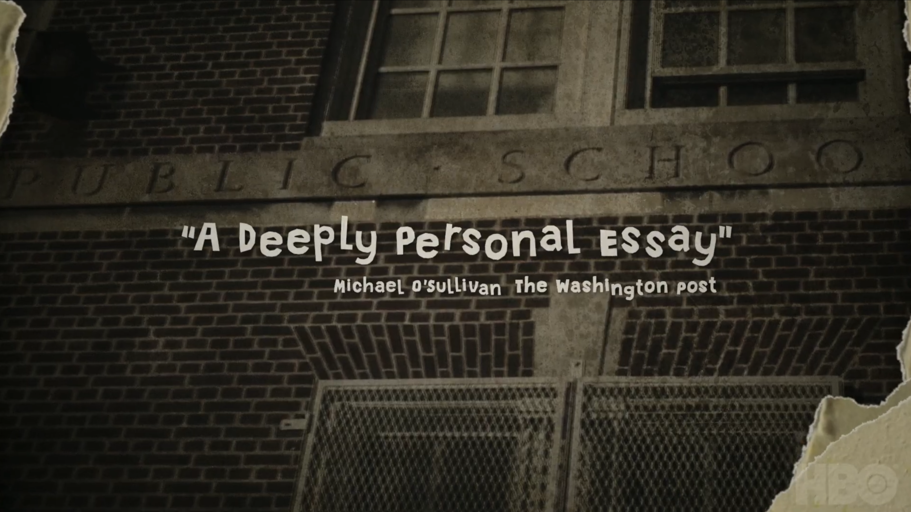
Trailer

Outcome
I'm genuinely happy with how the look and feel came together — the combination of a heavier grain, lower frame rate, and constant small imperfections made digital animation read as convincingly analog, and the rotoscoped sections tie the trailer graphics directly into the film's own world rather than feeling bolted on.