STEVE MAKES THINGS
DESIGN. ANIMATION. ART DIRECTION.
DESIGN
THE HAWK
THE DINK
MINIONS AND MONSTERS
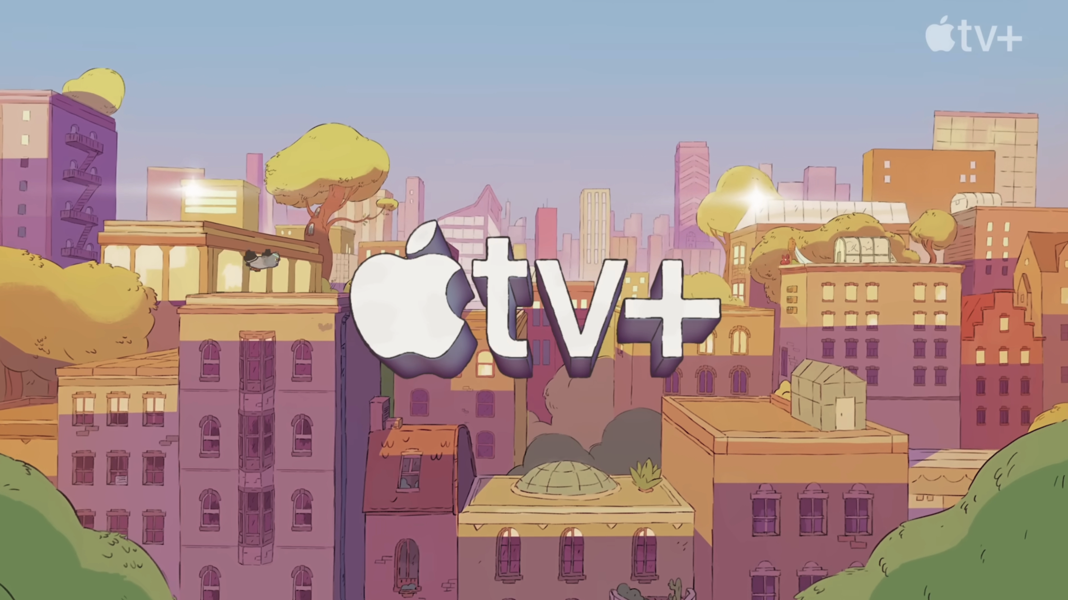
LULU IS A RHINOCEROS APPLETV+ LOGO
TIME BANDITS - SEASON 1
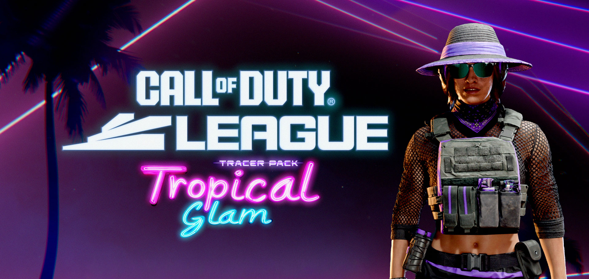
CALL OF DUTY LEAGUE - TROPICAL GLAM TRACER PACK
CALL OF DUTY MOBILE: SEASON 1 NEW ORDER
MORE
REEL
Motion Graphics Reel
PROJECTS
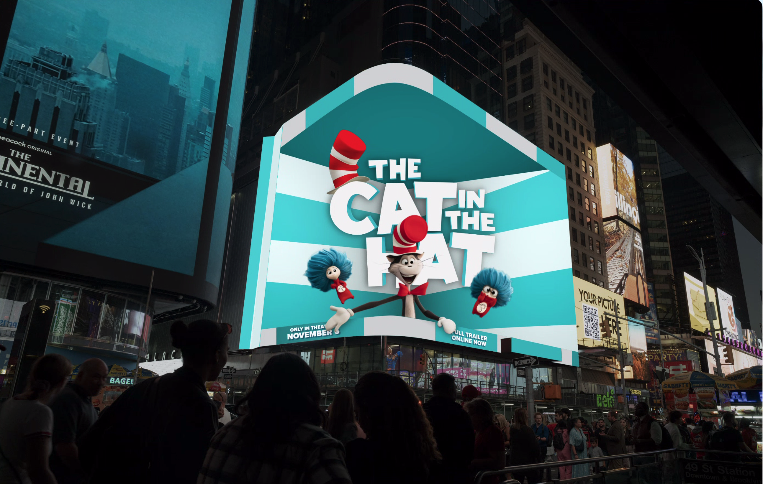
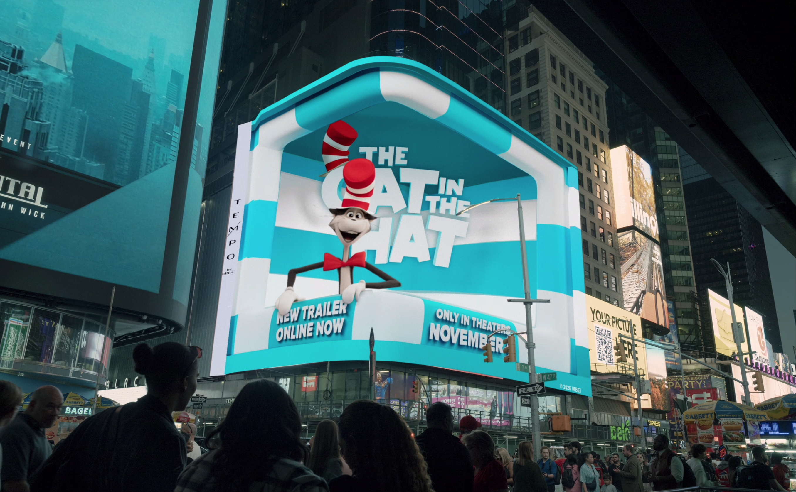
Cat in the Hat Times Square Billboard
CAT IN THE HAT TIMES SQUARE BILLBOARD

3D anamorphic digital billboard in times square NYC

View Project
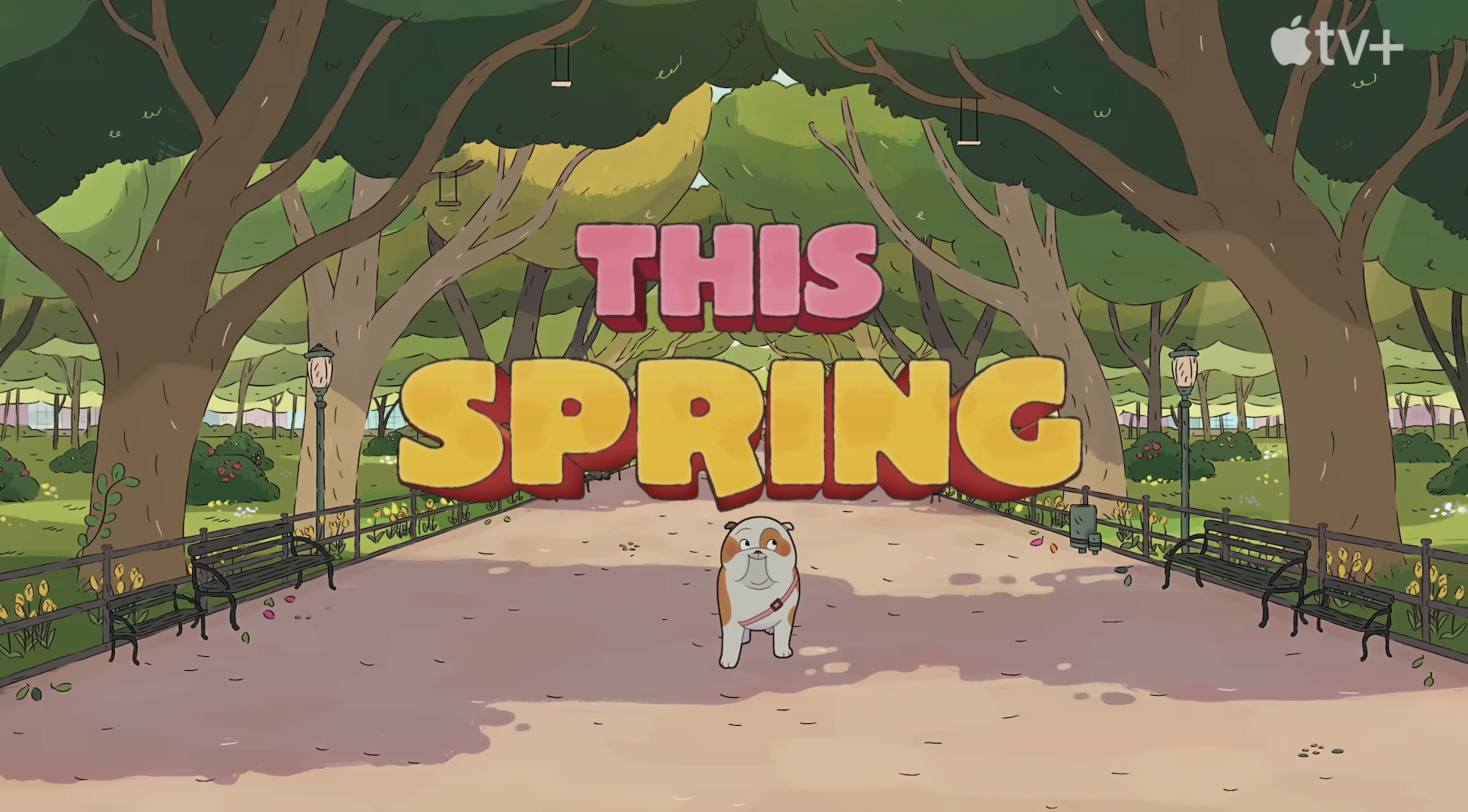
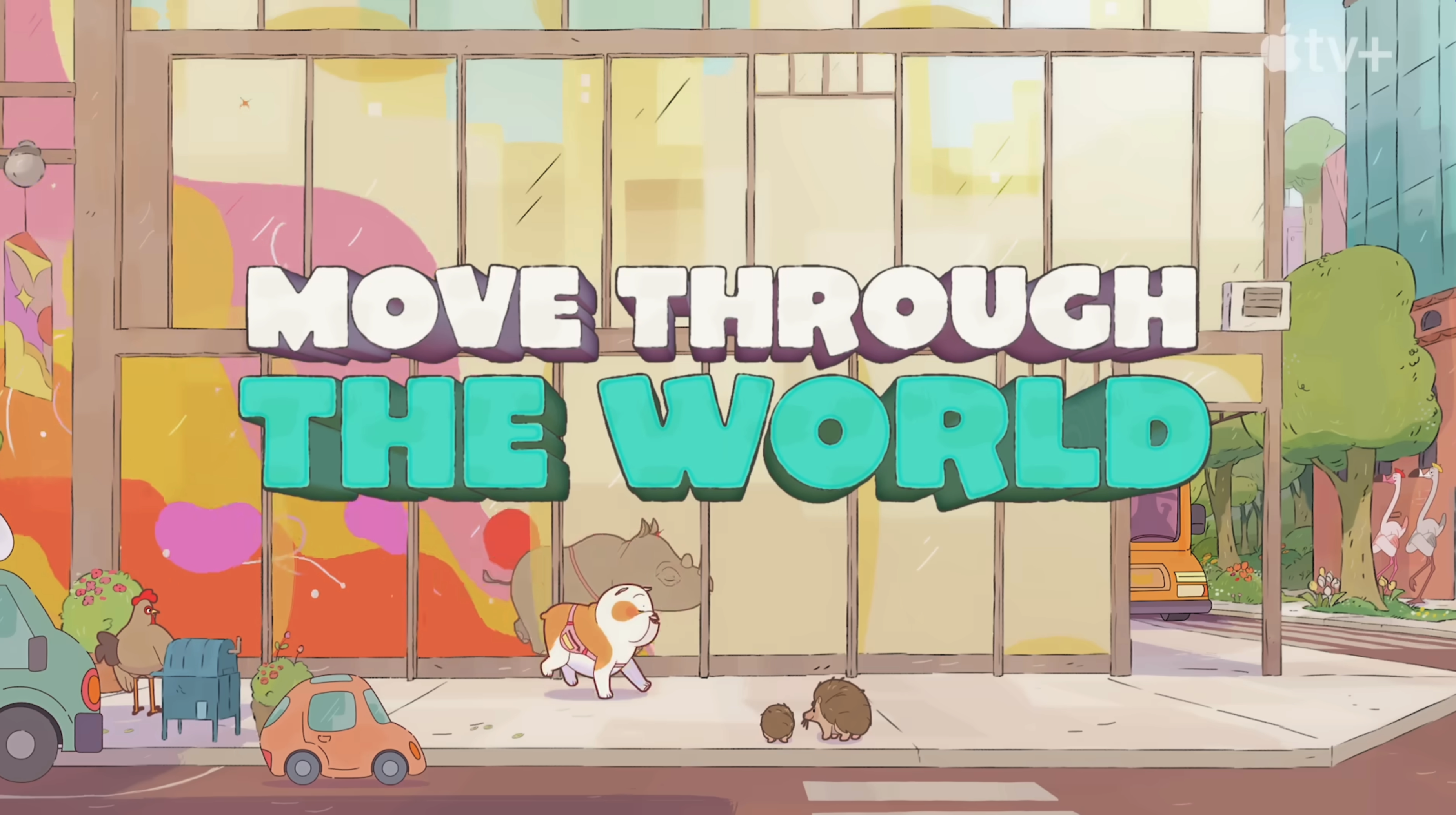
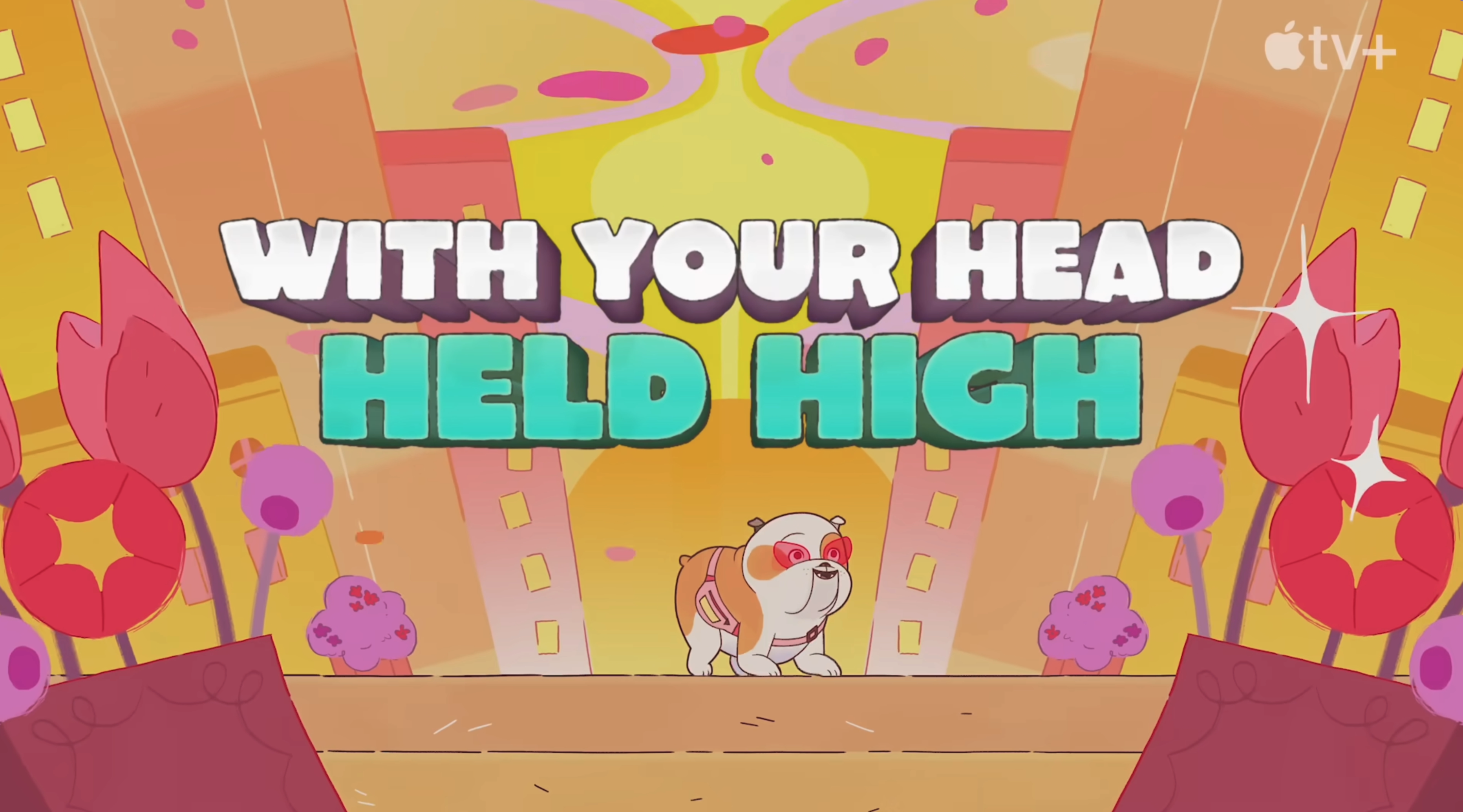
Lulu is a Rhinoceros
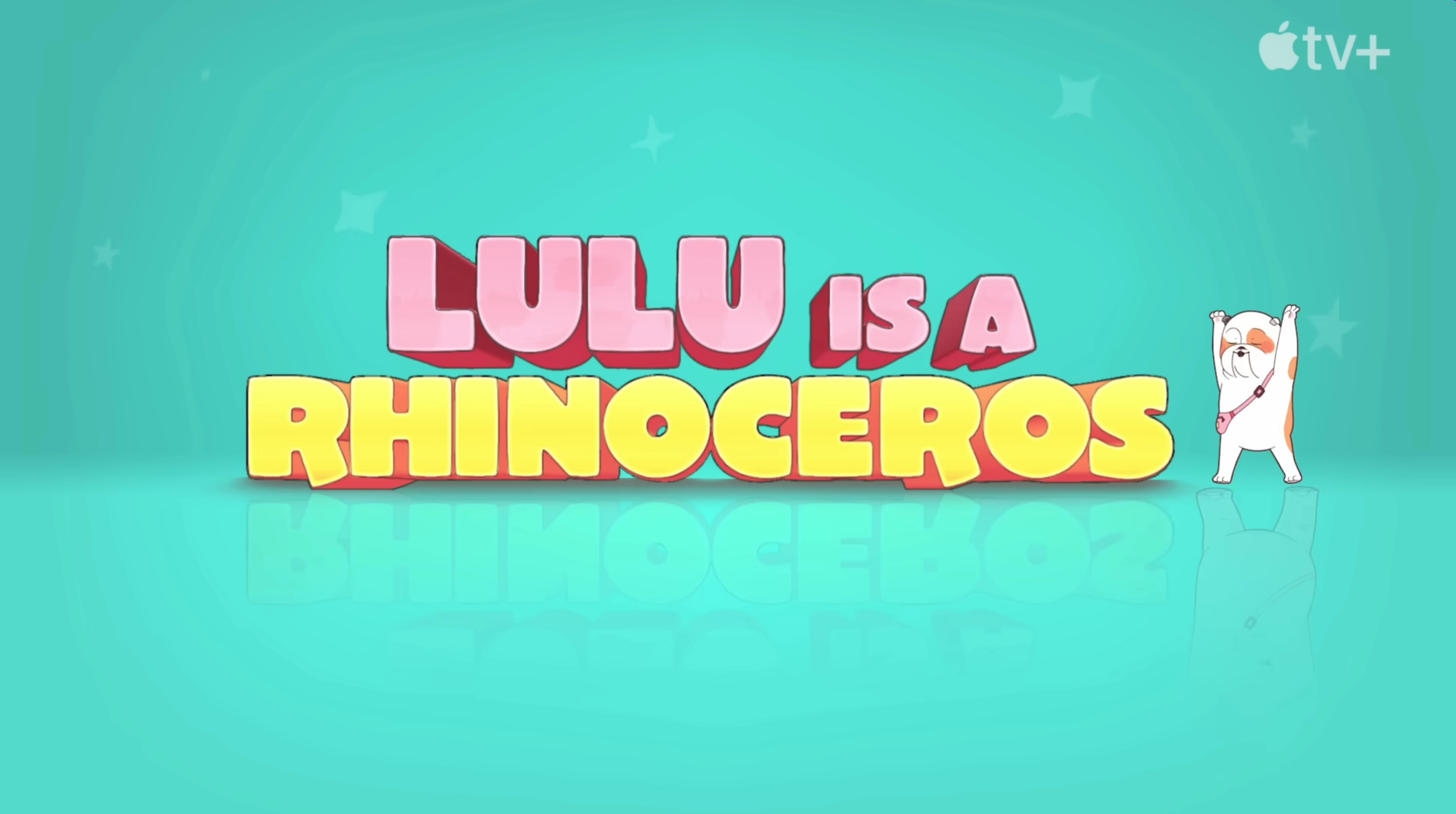
LULU IS A RHINOCEROS

Trailer graphics that live in the look and world of the show

View Project
When We Were Bullies
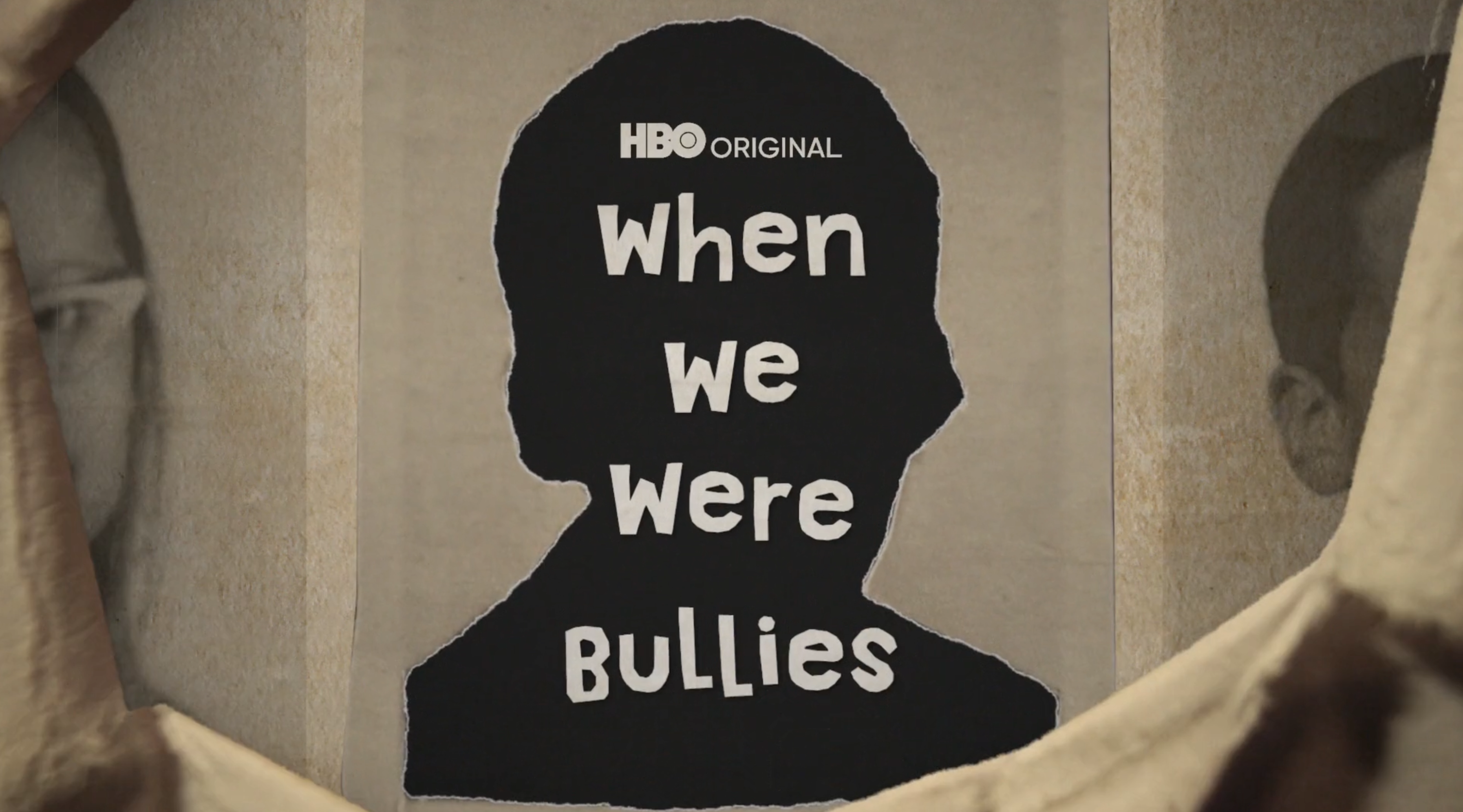
WHEN WE WERE BULLIES

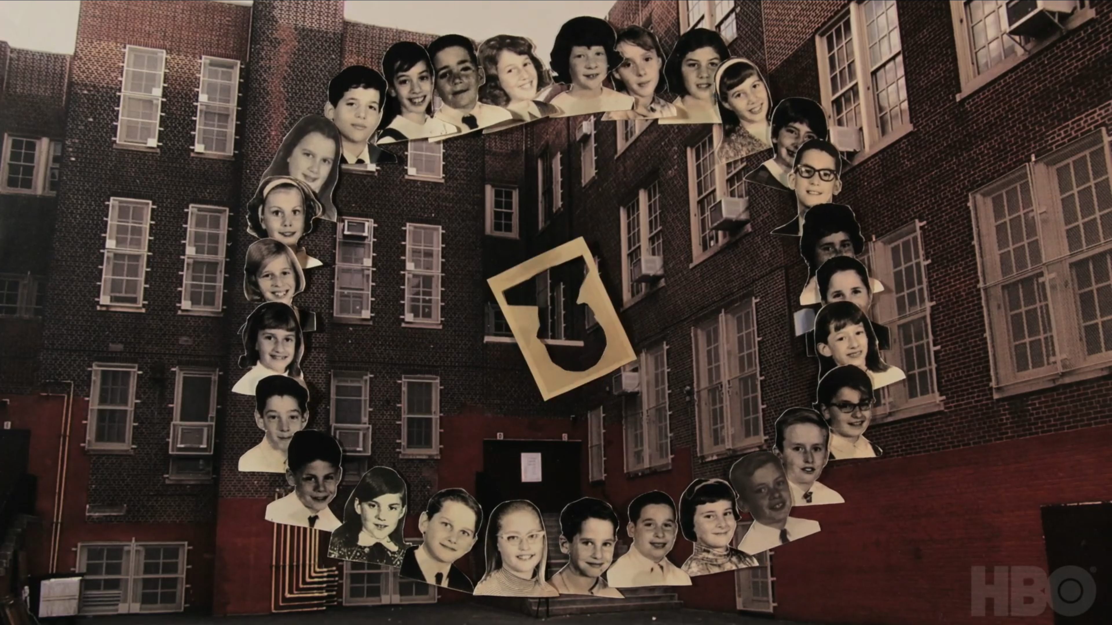
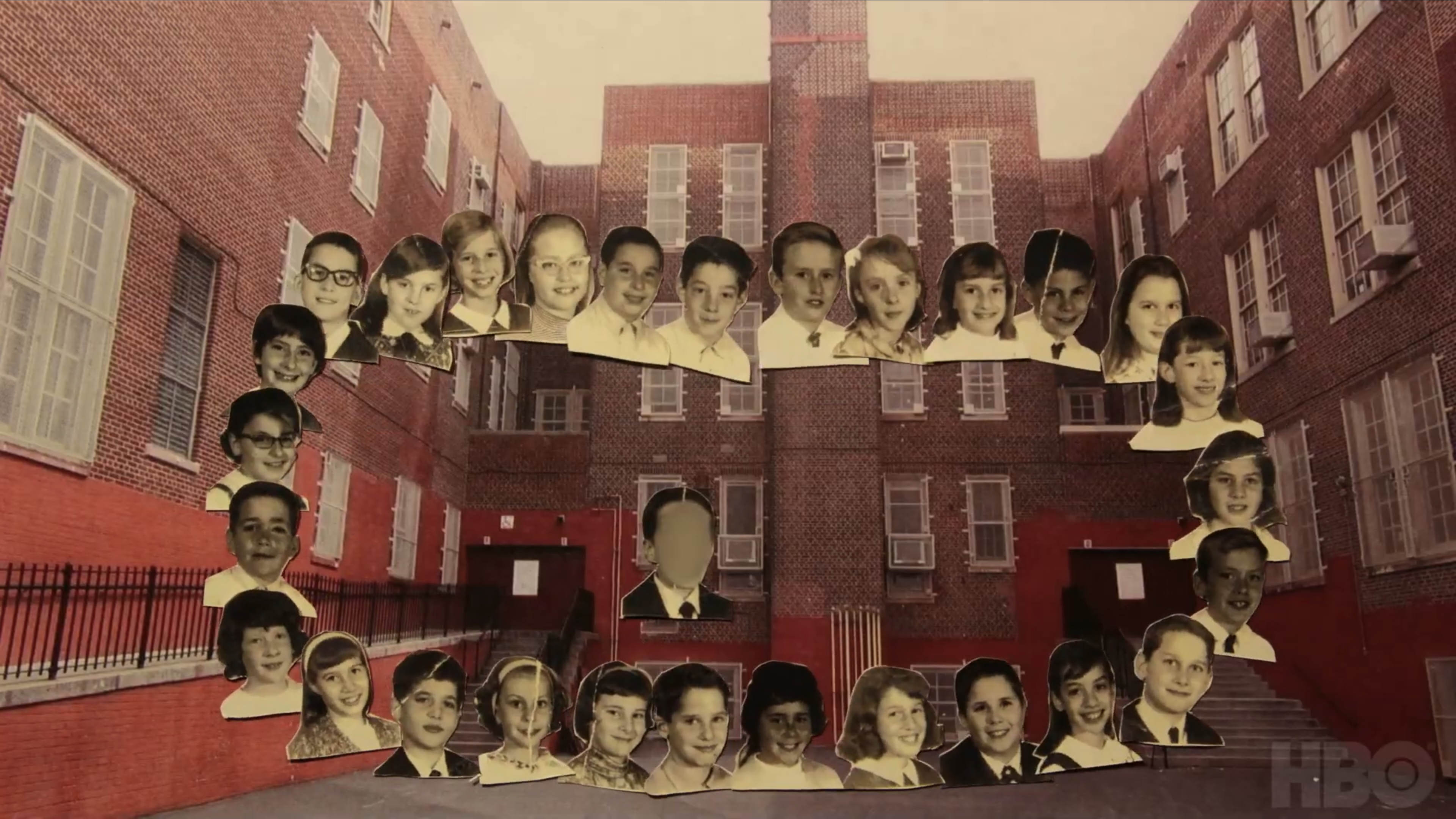
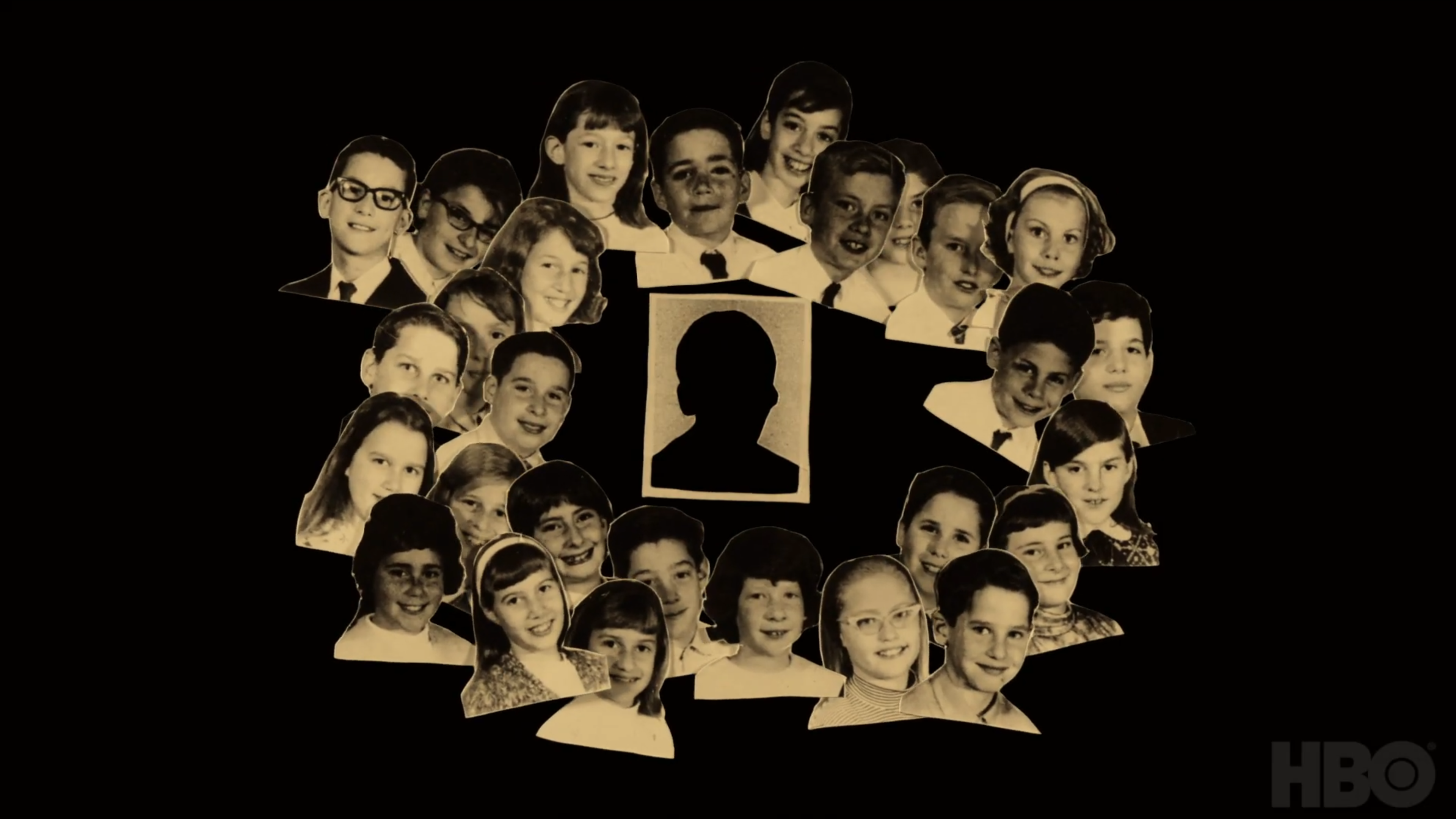
Stop motion inpspired graphics and main title for documentary film

View Project
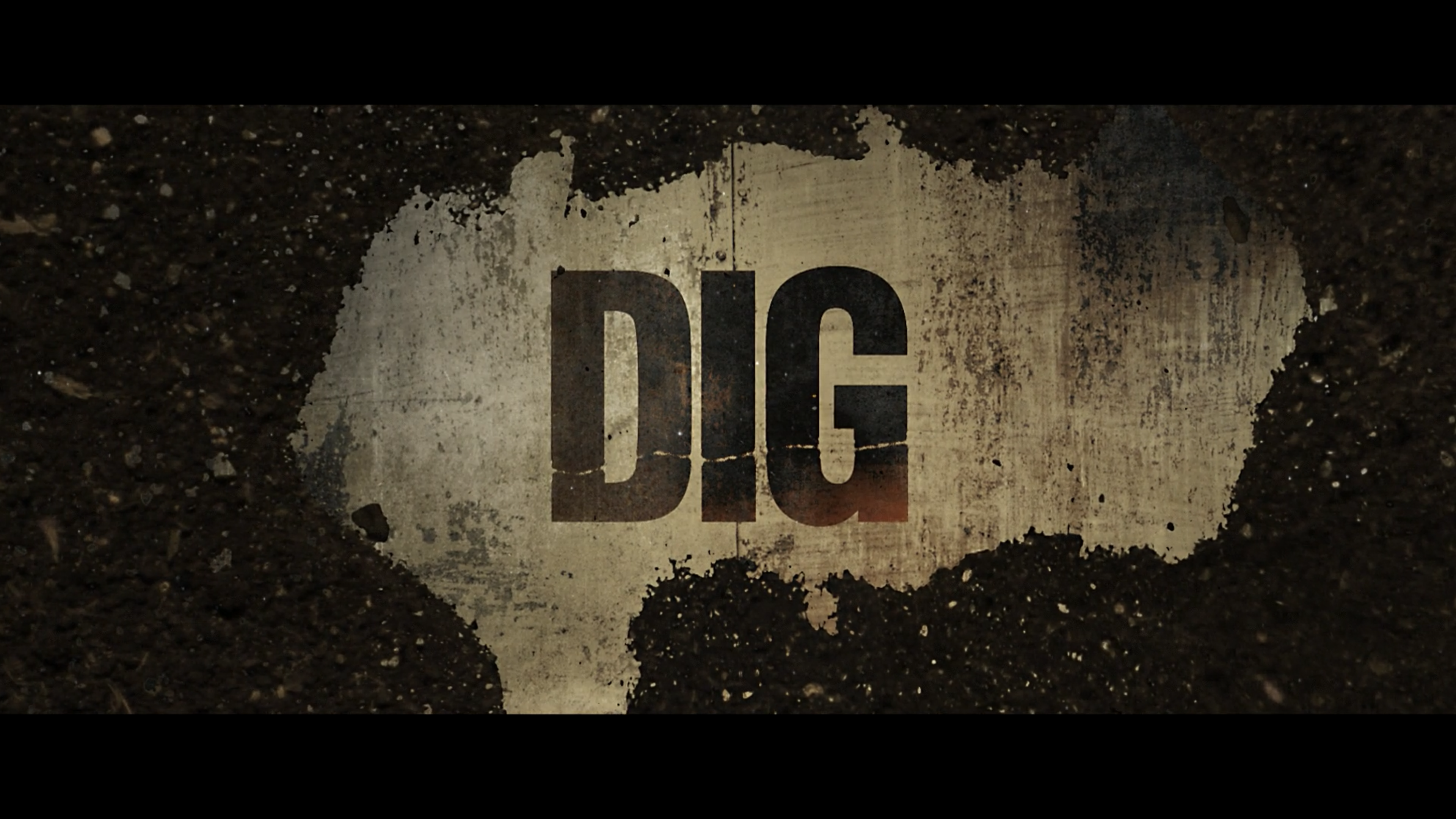
Dig
DIG

When you can't find the stock footage you need...you get creative

View Project
GAMES

A short text adventure I am building. Try it out and let me know any bugs you find!

MUSIC

Some music I wrote for sync. All songs are one-stop for nonexclusive licensing.

Select a track Now Playing
  • 1 Wild Like A River 3:23
  • 2 Distraction 3:43
  • 3 Wolves at the Door (Hard Times) 3:08
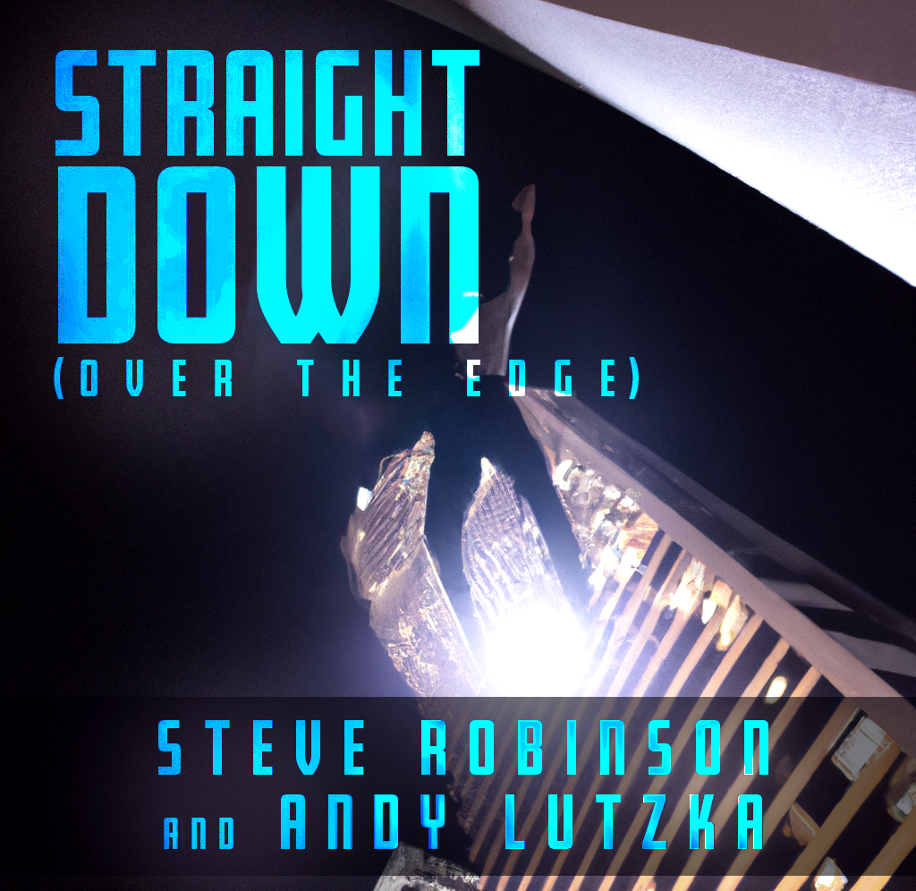
  • 4 Straight Down (Over the Edge) 4:20
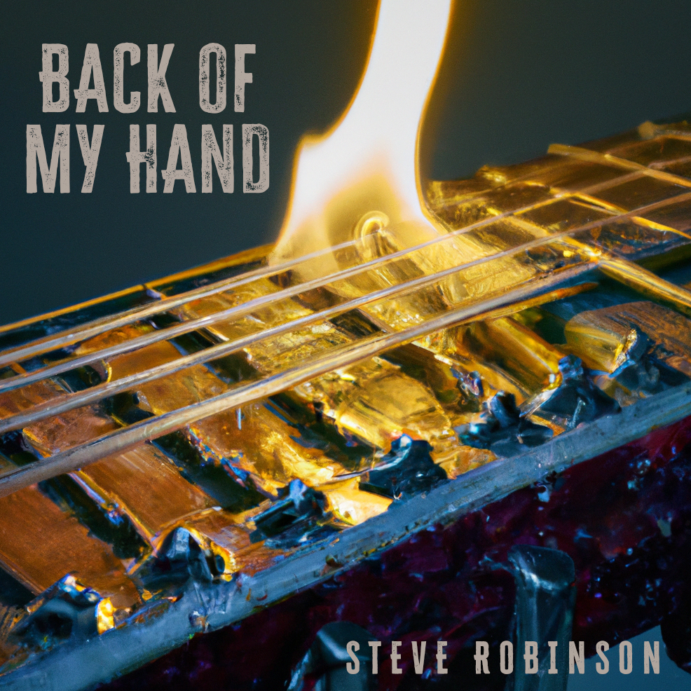
  • 5 Back of My Hand 1:32
AE TEMPLATES

A few After Effects templates I built to share. Grab the files and play with them yourselves. More coming soon!
Hand Inked Letters preview
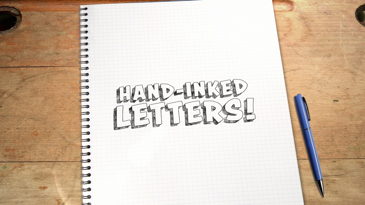
Hand Inked Letters

I developed a system to create a specific hand inked lettering style that can be used with just about any bold font. The look is bespoke and custom but quick to iterate and alter within after effects. Play with it and show me what you come up with!

Download .zip
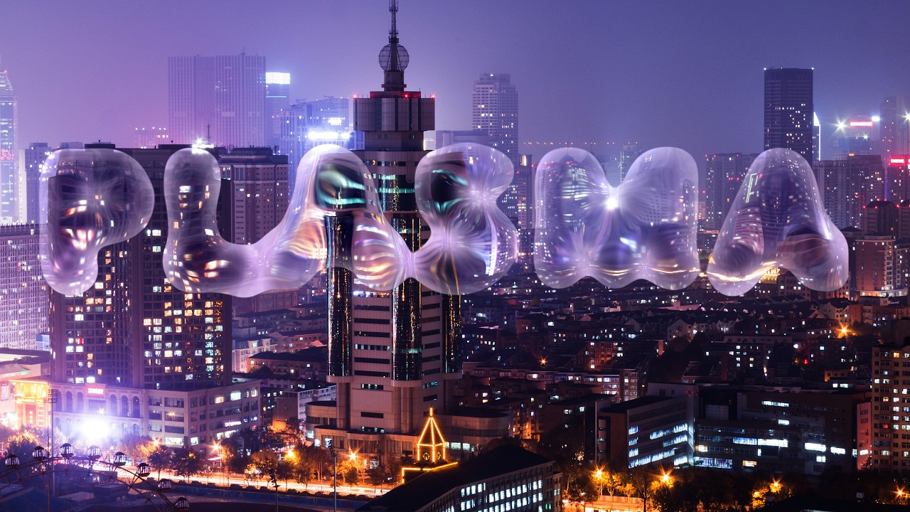
Template Two preview
Plasma Blobs

Plasma blob effect I built in after effects using no third party plugins. I would love to see what other artists could do with it.

Download .zip

ABOUT
Steve

I am a multidisciplinary creative thinker with deep roots in entertainment marketing and a wider view of where good ideas live. I can work across motion, design, writing, interactive, and whatever comes next. I think conceptually first, and reach for the right tool second.
Website designed and prototyped by Steve Robinson, coded with help from Claude AI
LULU IS A RHINOCEROS
Entertainment Marketing

LULU IS A RHINOCEROS

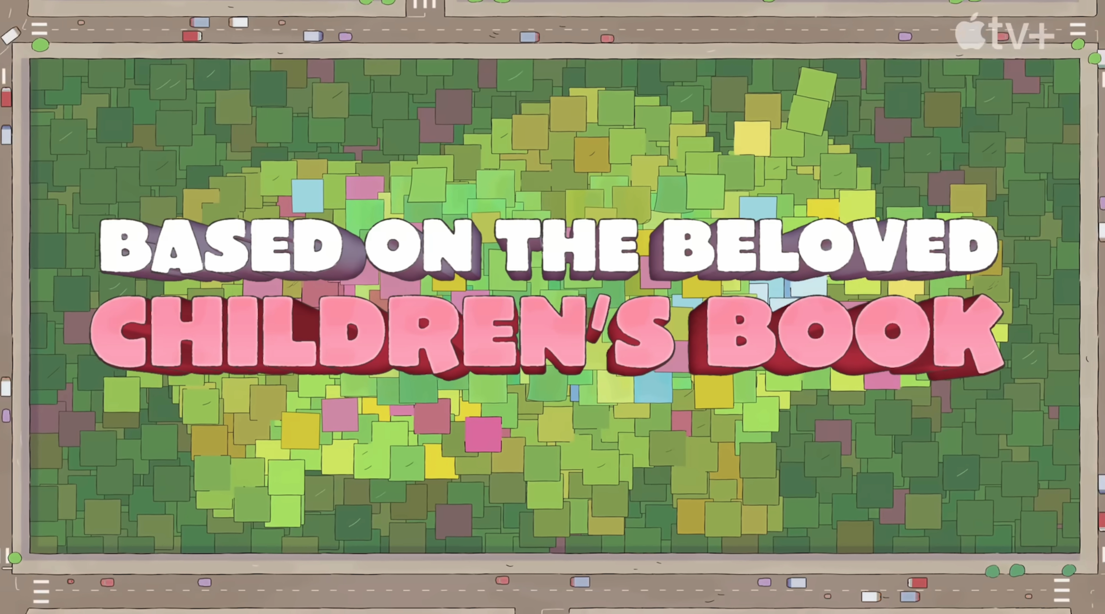
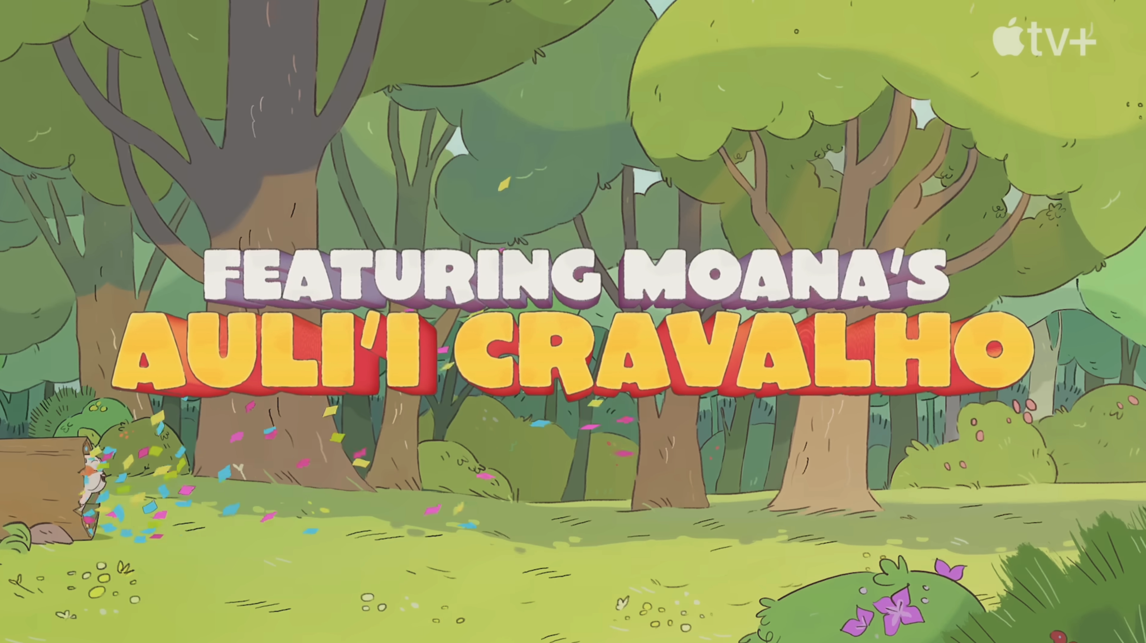
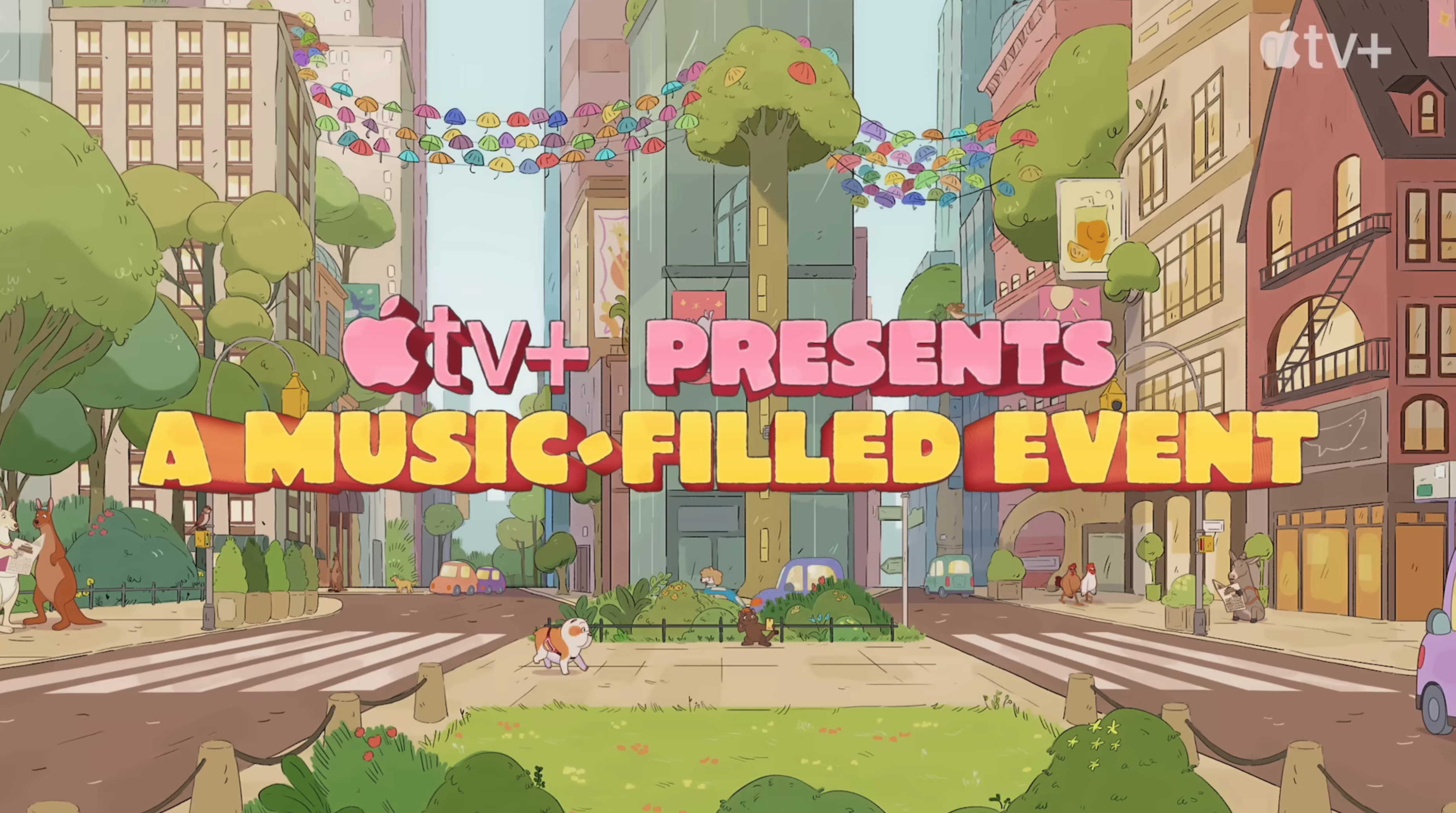
Trailer graphics and title card system for Lulu Is A Rhinoceros, matching the film's deep-extruded 3D illustrated style while giving each internal card its own identity within a shared visual world.

Role Designer
Client AppleTV+
Year 2024
Medium Trailer

Overview

When I was brought onto Lulu Is A Rhinoceros, the typeface and the deep-extruded 3D illustrated style were already established. My job was to take that style and make it feel like it genuinely lived in the same world as the film itself — building out a full title card system, including a distinct color palette for each internal card, all pulled from the actual art direction of the show.

LULU IS A RHINOCEROS detail
Main Title — Final Deliverable

The main title card, built in the deep-extruded 3D illustrated style established for the project.

Process

We wanted to hold onto the gradient look from the existing style, so I used the Colorama effect to reassign new color hues based on the existing gradient values — remapping each card to its own palette while keeping the same underlying gradient structure. It took some tuning to land exactly right, but I'm genuinely happy with how the effect turned out across the full set of cards.

Lulu Is A Rhinoceros title card

I also added a roughened, hand-drawn outline around each letterform — autotracing the shapes to build a stroke outline, then roughening the edge to give it a more organic, less mechanically perfect feel.

The final element came from the client directly: one of the actual Photoshop paint brushes used to color the show. Rather than hand-painting each graphic with it — which would've made revisions painful if more notes came in later — I rendered out a handful of variations of the brush in different sizes, hardness, and opacity into a separate texture file, then brought that into After Effects as an overlay. From there I could manipulate the placement of individual brush strokes with effects, keeping everything looking clean and organic with no obvious repeating pattern across cards.

Lulu Is A Rhinoceros title card

Trailer

Trailer thumbnail

Final Thoughts

Between the recolored gradients, the hand-drawn outlines, and the client's own brush texture worked into the compositing, the final set of cards feels like it belongs in the same world as the film — distinct from card to card, but clearly part of one system.

CAT IN THE HAT TIMES SQUARE BILLBOARD
Entertainment Marketing

CAT IN THE HAT TIMES SQUARE BILLBOARD

A 3D anamorphic billboard built for the curved TSX screen in Times Square, using forced perspective to give the illusion of depth when viewed from street level.

Role Design/Animation
Client Warner Bros. Animation
Year 2026
Medium Digital Billboard

Overview

The TSX building's curved screen in Times Square gives advertisers a rare opportunity: because the display physically wraps around the corner of the building, content viewed from the right angle on the street can appear to break out of the screen and exist in three-dimensional space. I'd wanted to work on one of these anamorphic builds for a long time, so when the chance came up to build one for Cat in the Hat, I dove in to figure out exactly how the format works from the ground up.

The result plays the toolkit provided by Warner Bros. Animation marketing as a fully dimensional scene living on the corner of the building, timed to build, hold, and resolve back into the flat screen.

CAT IN THE HAT TIMES SQUARE BILLBOARD previs animatic
Previs Animatic

An early rough pass blocking out timing, camera, and composition before moving into the full 3D build.

Process

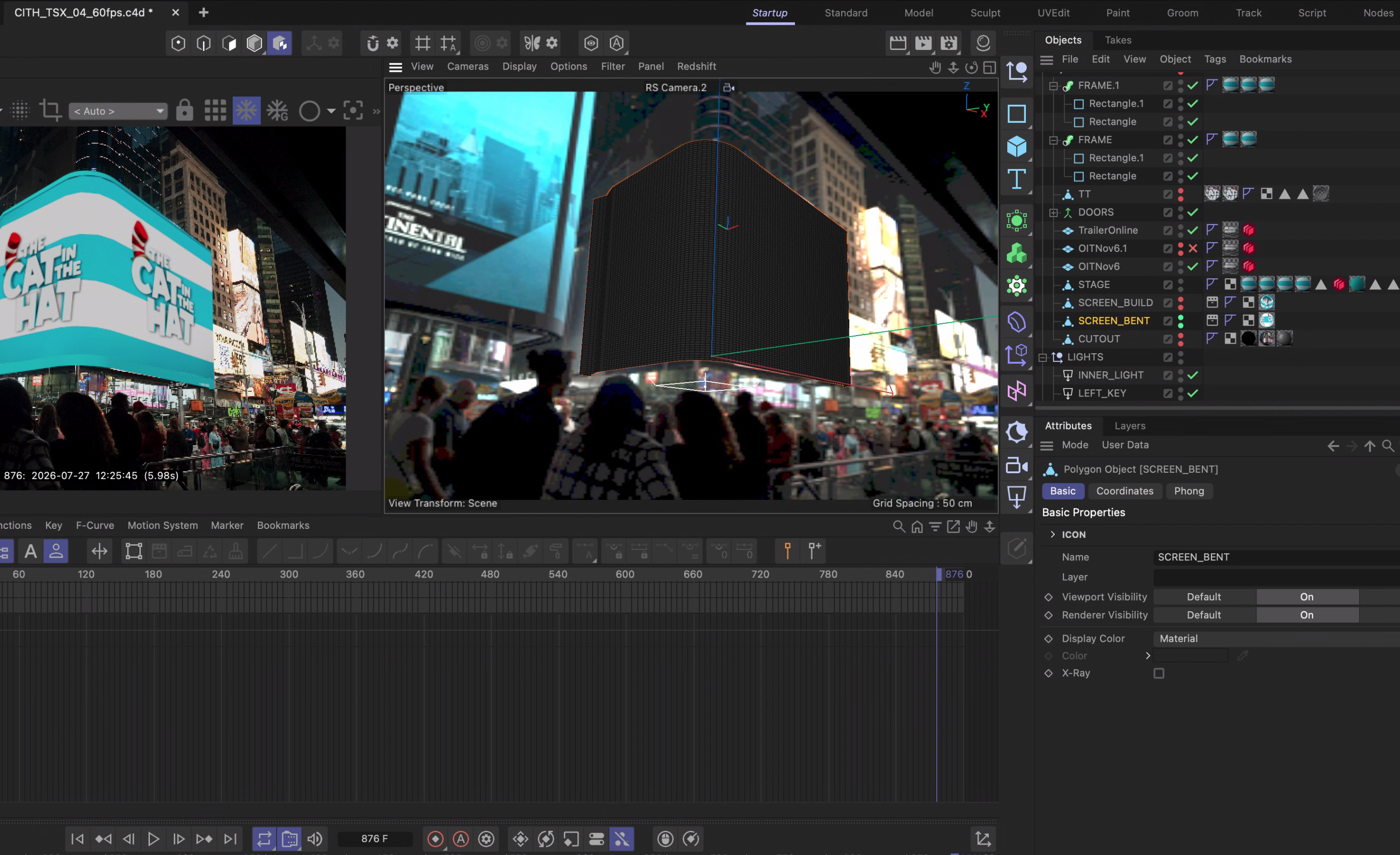
The first step was calibrating a 3D camera in Cinema 4D against a reference photo of the actual building, matching lens, position, and perspective so that anything built in 3D would line up correctly with the real screen when viewed from the street. From there I built 3D geometry sized to the exact aspect ratio and specs of the physical display, and used that as a frame of reference — essentially a set of guides showing exactly where content would get cut off by the edges of the screen.

CAT IN THE HAT TIMES SQUARE BILLBOARD detail
3D Camera Calibration

The 3D camera set up in Cinema 4D, matched against a reference photo of the building so the geometry would align with the physical screen from the correct viewing angle.

CAT IN THE HAT TIMES SQUARE BILLBOARD detail
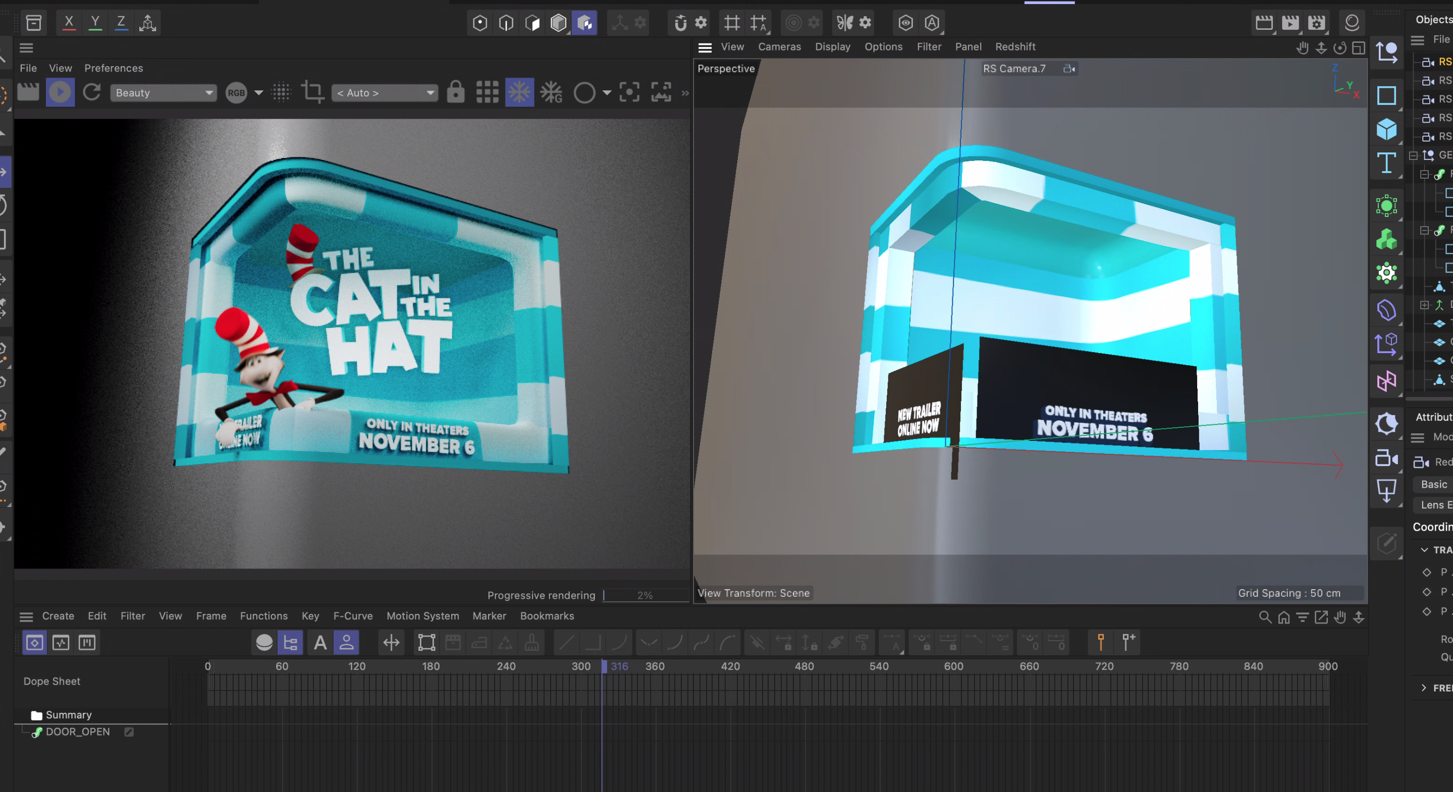
3D Stage Build

The stage environment built around the calibrated camera, where the Warner Bros. Animation toolkit assets were placed before rendering out for After Effects.

With that working area established, I built out the full 3D stage environment the toolkit assets — provided by Warner Bros. Animation marketing — would live inside. I rendered an image sequence out of that scene and brought it into After Effects to fine-tune color, timing, and animation. I kept as many elements as possible editable at the After Effects stage specifically so client notes and internal changes could be made quickly without having to go back into the 3D scene each time.

After Effects Demo

After Effects demo video thumbnail

Once the demo version was approved, I rendered a new image sequence out of After Effects and brought it back into Cinema 4D, then projected it onto the screen geometry using camera mapping — effectively UV-mapping the flat, finished image onto the 3D surface the same way the physical screen itself would display it. With the texture baked onto the geometry, I exported the final output and sent it to the client to route to the screen vendor.

CAT IN THE HAT TIMES SQUARE BILLBOARD detail
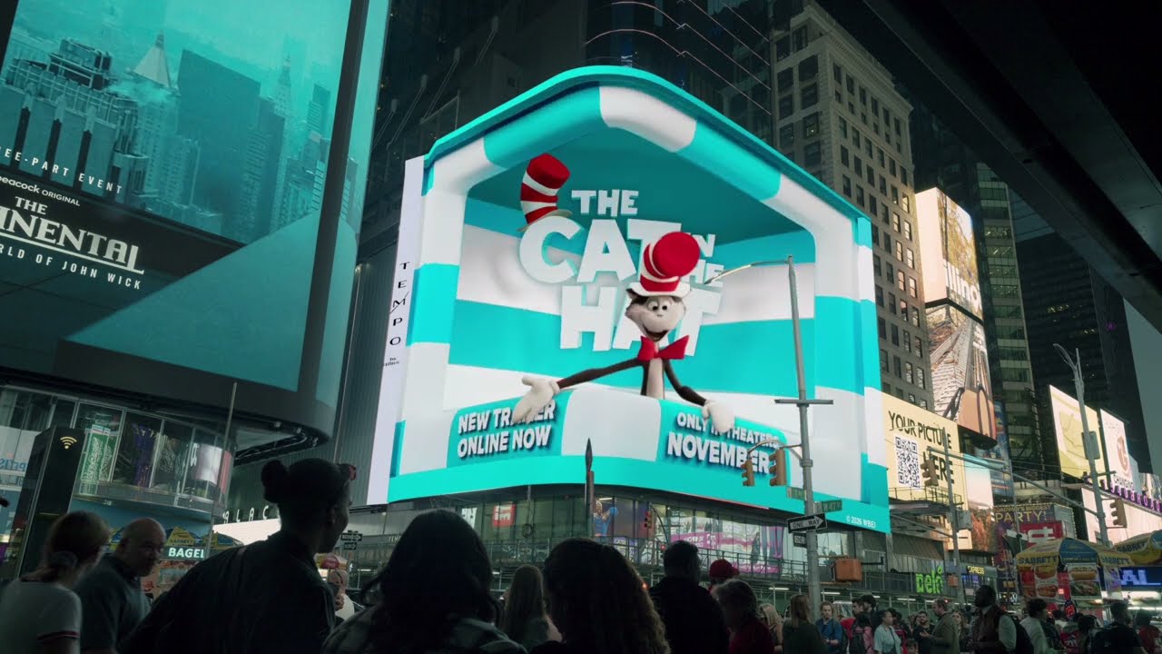
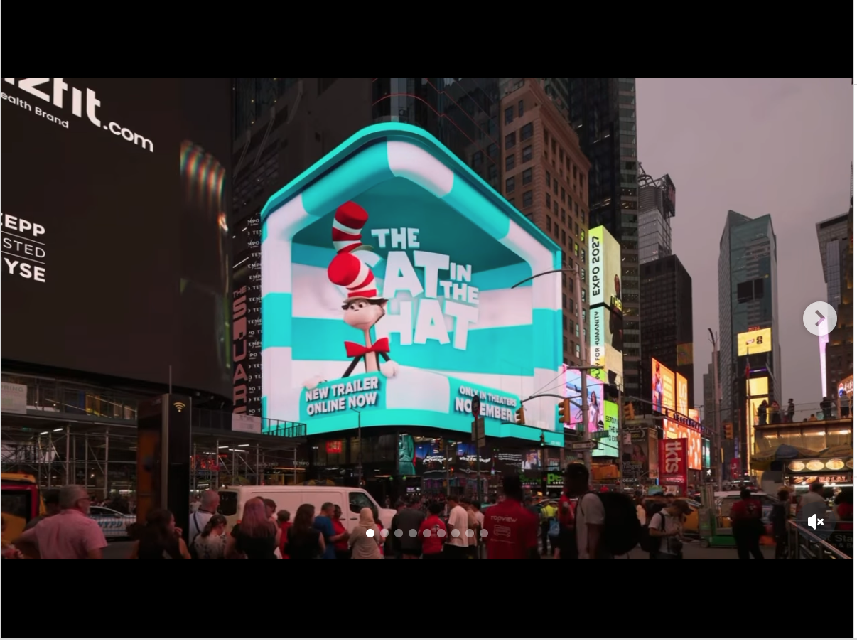
Final Output — Corner Screen

The finished piece, timed and color corrected for how it reads on the physical display in Times Square.

Outcome

The final piece played on the TSX screen in Times Square, on one of the most visible corners in the city. It was also a chance to fully reverse-engineer an anamorphic pipeline I'd wanted to understand for years — camera calibration, 3D staging, and camera-mapped re-projection all working together to make a flat screen read as real depth from the sidewalk.

WHEN WE WERE BULLIES
Documentary / Print

WHEN WE WERE BULLIES

Trailer graphics and title card system for When We Were Bullies, built around a stop-motion-inspired look pulled straight from the film's own animation style.

Role Art Director
Client HBO Documentary
Year 2024
Medium Trailer

Overview

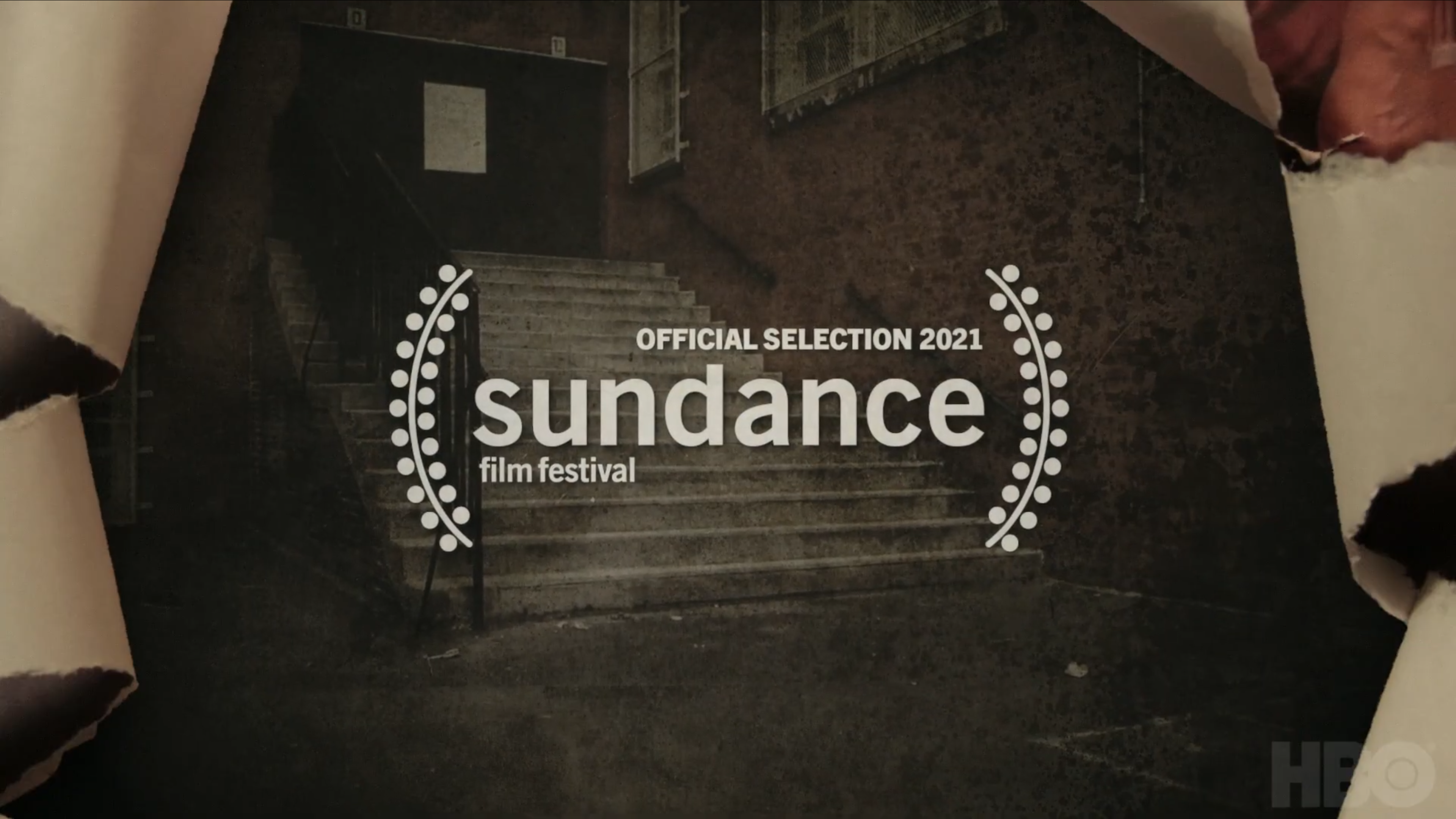
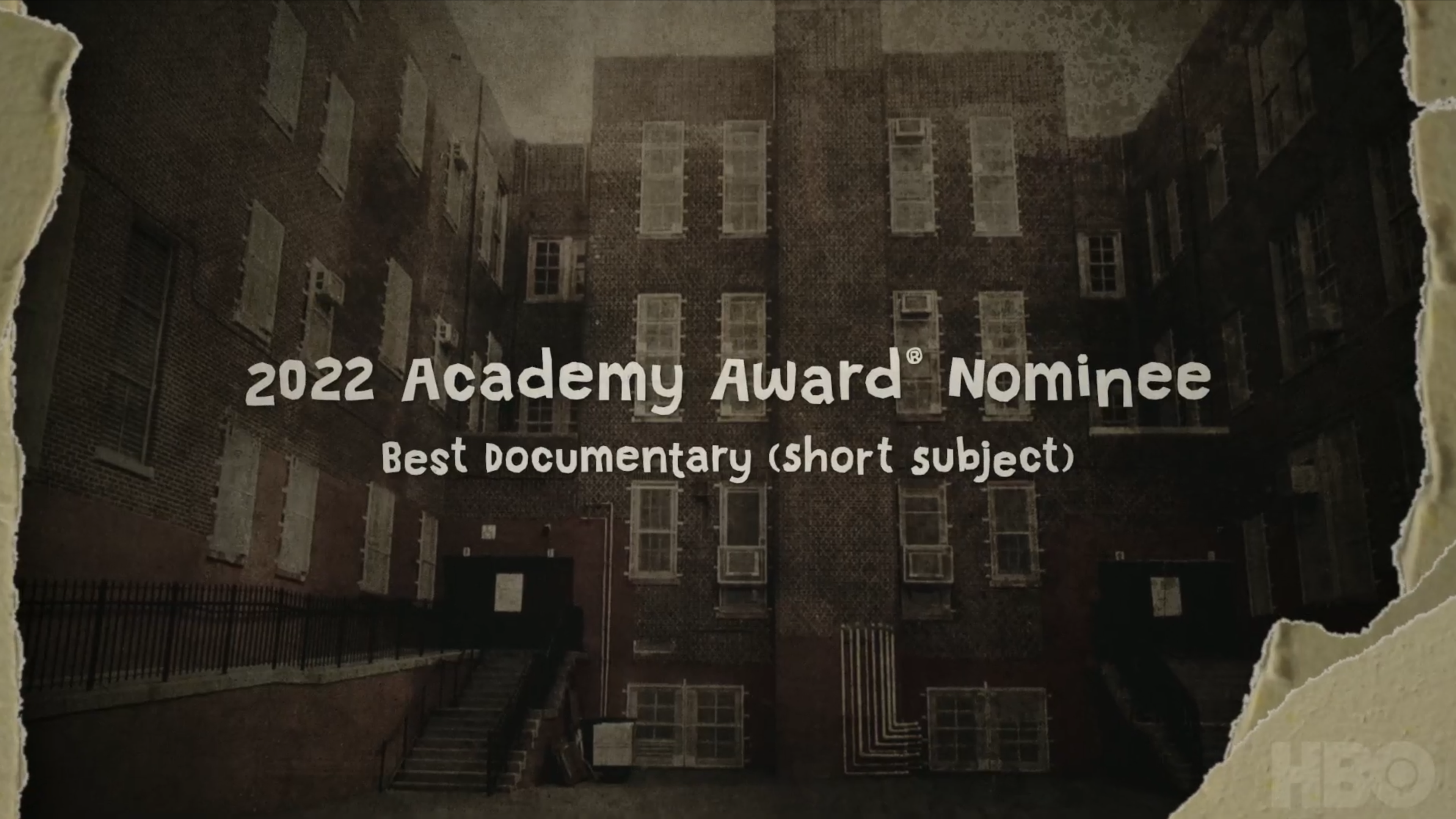
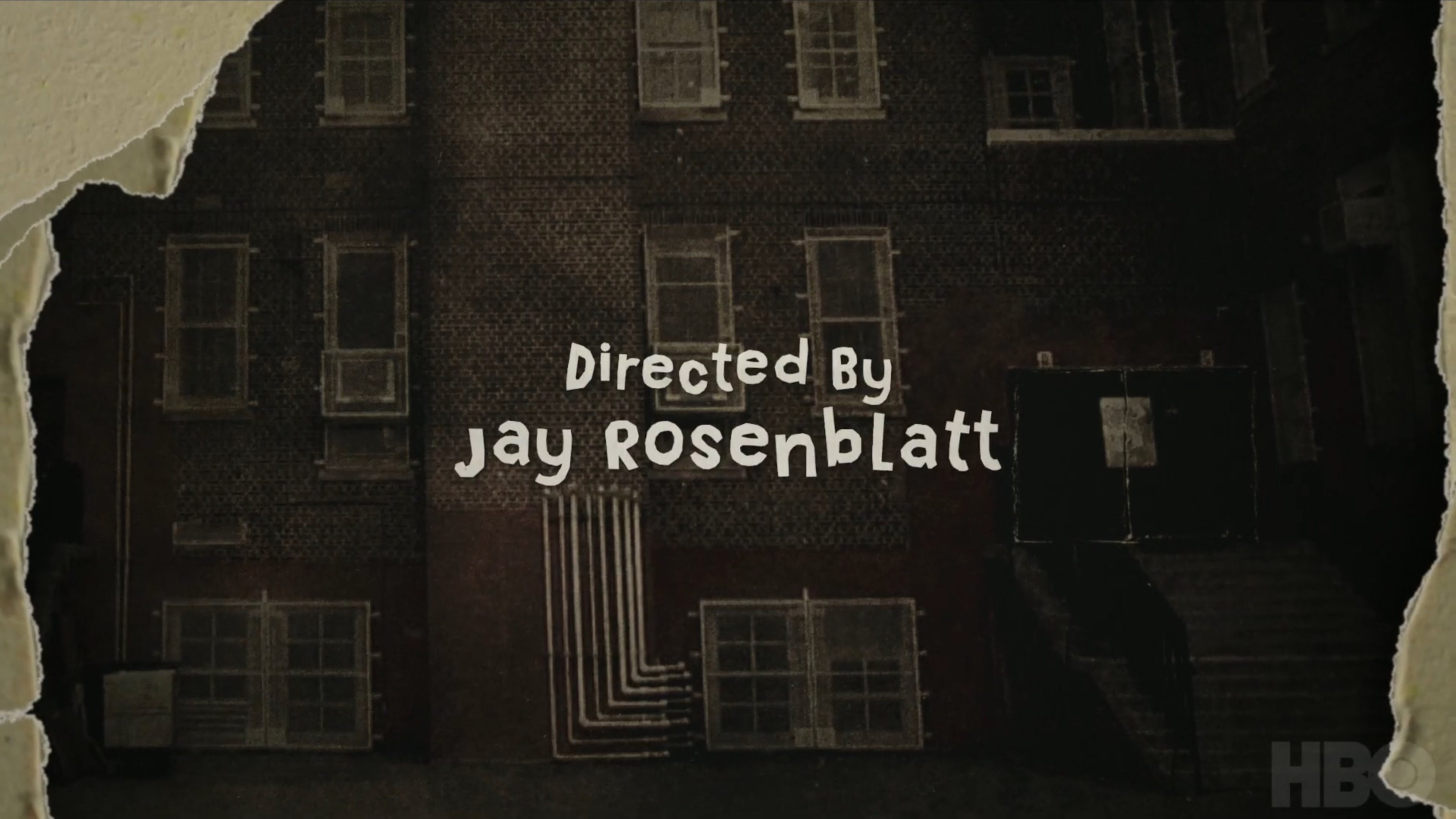
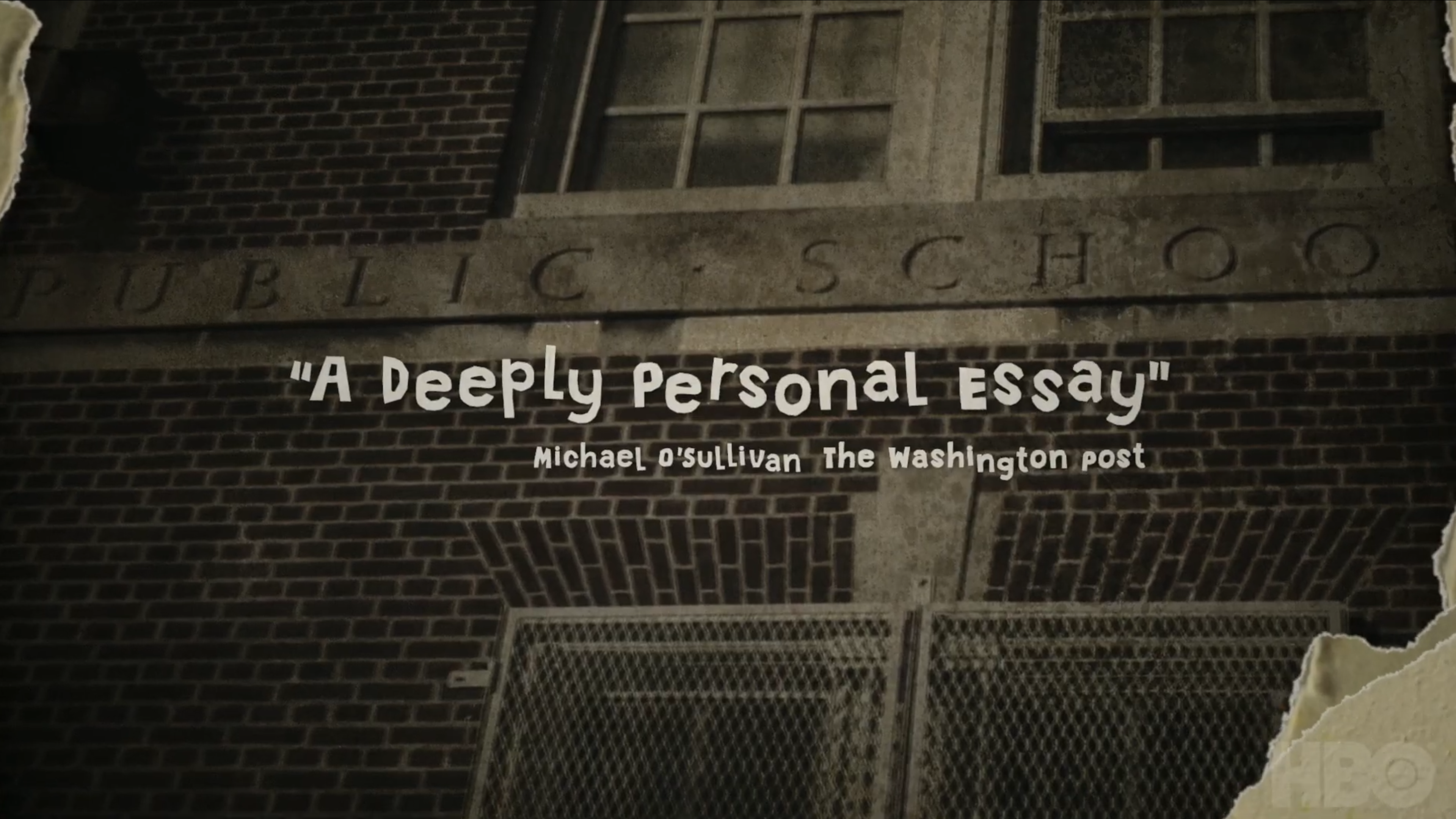
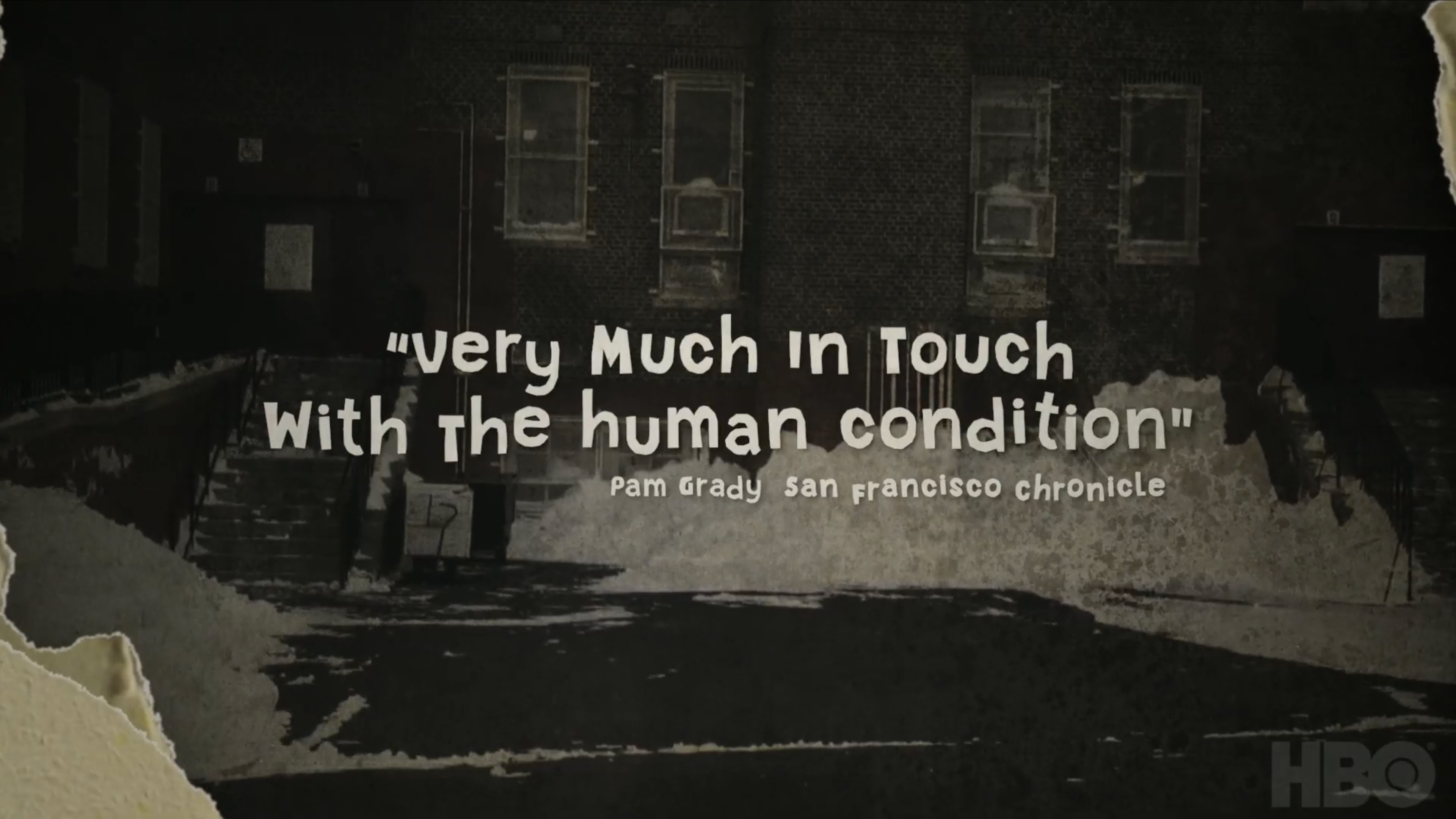
This documentary used a very specific stop-motion animation style throughout, harkening back to educational films from the 1960s to match the era the story was set in. Inspired by that aesthetic, I designed the internal cards and the main title for the trailer, working to make graphics built in After Effects feel like they belonged in the same world as actual analog stop motion.

Reference

Stills from the film's own animation — the visual target the trailer graphics needed to match.

When We Were Bullies film reference still
WHEN WE WERE BULLIES detail
Main Title

The main title card, built to sit naturally alongside the film's own stop-motion animation.

Process

Since I was working in After Effects rather than shooting actual stop motion, I had to push the animation in a few specific directions to make it read as cohesive with the film's animated sections. I brought the frame rate way down, added a heavy layer of texture and grain across everything, and gave the animated letterforms constant small imperfections and movement — as if they'd been slightly bumped between frames, the way real stop motion often is.

When We Were Bullies title card

For a handful of the internal cards, including the main title, I rotoscoped existing animation from the film itself and integrated my graphics directly into it — matching movement and timing closely enough that the two blend together seamlessly rather than sitting as separate layers.

When We Were Bullies title card

Trailer

Trailer thumbnail

Outcome

I'm genuinely happy with how the look and feel came together — the combination of a heavier grain, lower frame rate, and constant small imperfections made digital animation read as convincingly analog, and the rotoscoped sections tie the trailer graphics directly into the film's own world rather than feeling bolted on.

DIG
Entertainment Marketing

DIG

Main title design and trailer graphics for Dig, a suspenseful crime thriller — including a title reveal built from practical dirt effects shot and composited from scratch.

Role Designer / Animator
Client Saban Films
Year 2024
Medium Trailer

Overview

Dig is a suspenseful crime thriller, and I was brought on to design the main title and create graphics for the trailer. During early discussions about the title reveal, it was floated as an idea that the title could animate on using stock footage of dirt blowing across the screen — a literal, tactile nod to the film's title. It's the kind of detail that sounds simple in a meeting and turns out to be much more interesting to actually pull off.

After searching for existing stock footage and coming up short of anything that matched what I had in mind, I decided to just shoot it myself.

Process

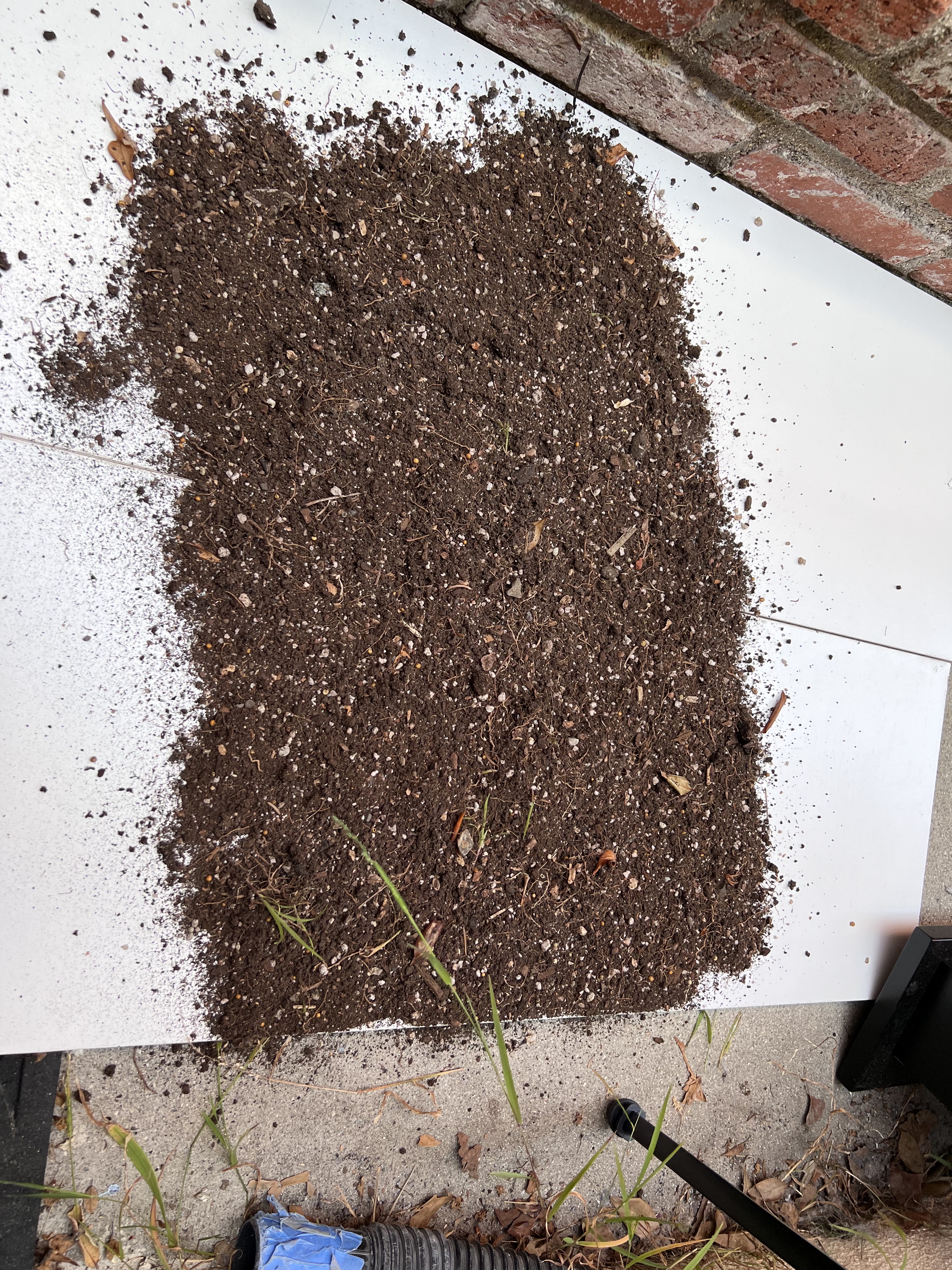
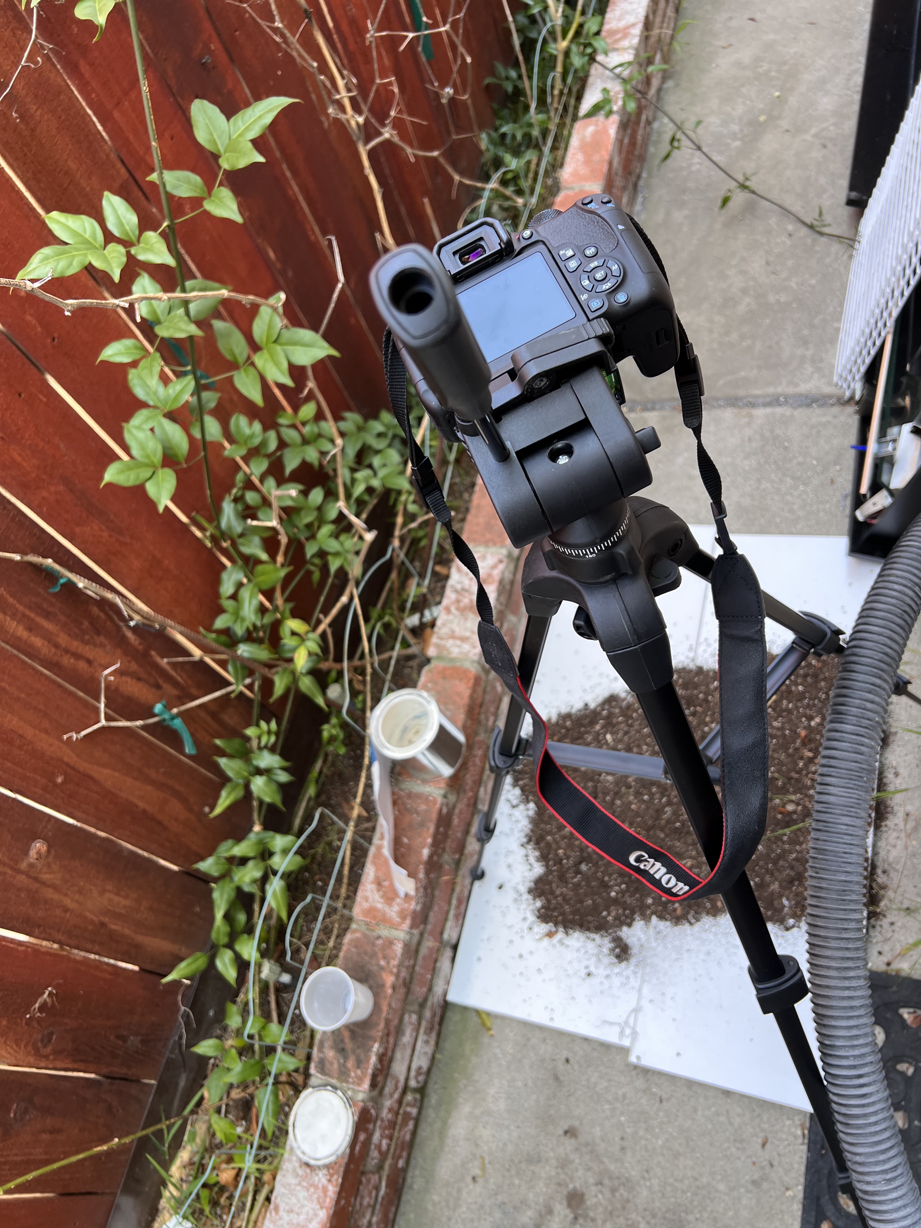
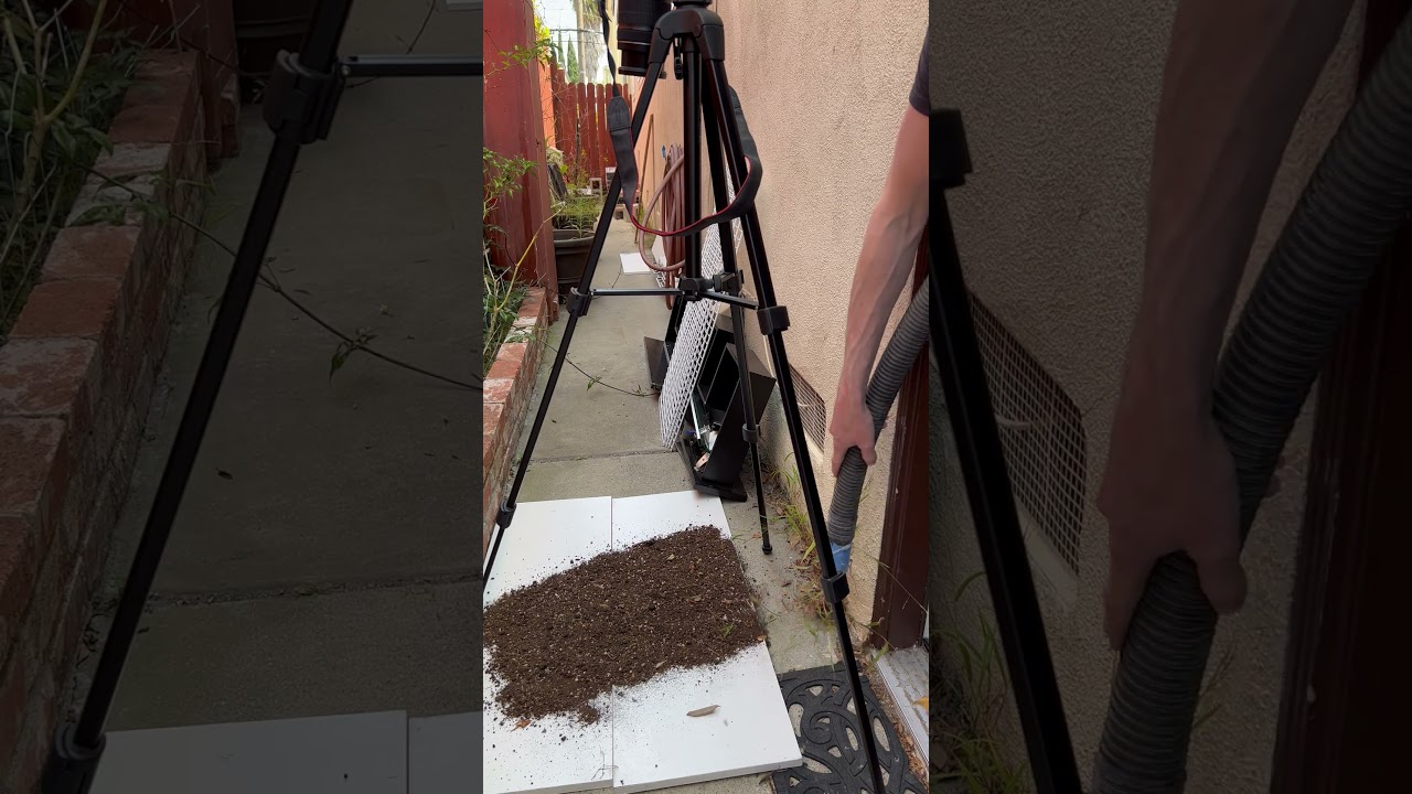
I set up a small practical effects stage at home — a white card as a clean backdrop, actual dirt gathered from the side of my house, and a shop vac running in blower mode to send it flying across frame. I filmed several passes of the dirt blowing offscreen, then brought that footage into post to clean it up, color correct it, and composite it directly with the main title design.

DIG behind the scenes — practical effects rig
The Rig

A small practical effects setup — white card backdrop, dirt gathered from the side of the house, and a shop vac in blower mode to send it flying across frame.

DIG behind the scenes — dirt effects footage
Shooting the Effect

Filming several passes of the dirt blowing offscreen before bringing the footage into post for cleanup, color correction, and compositing with the main title.

Behind the Scenes

Behind the scenes video thumbnail

Shooting the Effect

Behind the scenes video of the actual take used in the main title.

DIG detail
Key Art — Final Deliverable

The finished main title, composited with the practical dirt effects shot for this project.

Everyone on the project was happy with how it turned out, and it's exactly the kind of problem I like most — a design need that doesn't have an obvious off-the-shelf solution, solved by finding (or shooting) something new and folding it into the workflow.

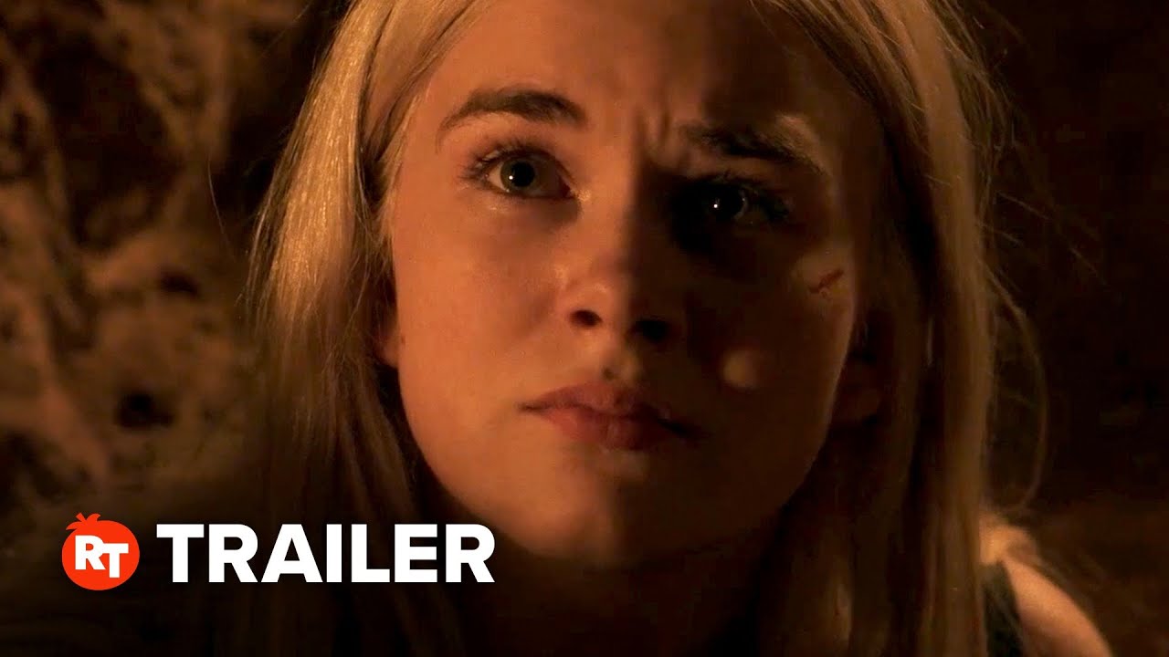
Trailer

Trailer thumbnail

Outcome

The dirt-blowing title reveal was a perfect ending to the trailer. Adding a small practical effects detail made it read as far more tactile and real than a stock or fully CG solution would have. I was very happy with the final execution

DESIGN REEL PROJECTS GAMES MUSIC AE TEMPLATES ABOUT CONTACT INSTAGRAM